
Coachable: Brand Identity


May 2025
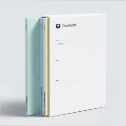
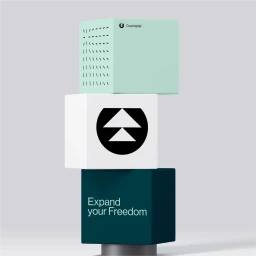
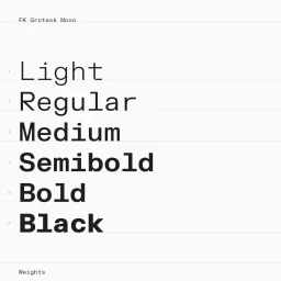
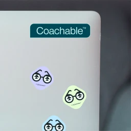
The brand identity for Coachable, an apps and digital platform, establishes a modern visual language through a minimalist and highly structured design system. Graphic design by Konpo informs a cohesive aesthetic that spans digital interfaces, print collateral, and environmental applications. The system centres on a precise typographic hierarchy—utilizing FK Grotesk Mono and Neue Montreal—paired with a deliberate color palette of dark teals, mint greens, and neutral tones. Key assets include motion graphics, 3D renders, and UI mockups that emphasize technical clarity and geometric precision. Visie Admin served as project owner, overseeing the development of corporate guidelines that ensure consistent application across all touchpoints.
Horizontal, Commercial, Clean, Minimalist
