
CE Europa: Brand Identity




Aug 2026
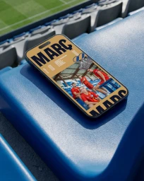
The brand identity for CE Europa, crafted with the strategic design expertise of Boc Studio, represents a sophisticated evolution in sports communication. Moving beyond traditional club branding, this project synthesizes a rich visual language that bridges the gap between heritage and modern digital engagement. The identity leverages a minimalist and professional design philosophy, heavily utilizing animation, typography, and live-action technique to breathe life into the club's iconic crest and colors. By integrating high-contrast graphic overlays and rhythmic halftone patterns, the studio creates a cohesive system that thrives both in the high-stakes environment of the stadium and across digital platforms. The narrative of the project is anchored by a deep navy, warm gold, and vibrant red color palette, which is applied with precision across motion assets, web-based UI tools, and dynamic promotional content. Throughout the collateral, the brand successfully leans into a lifestyle-focused documentary aesthetic, capturing the raw energy of fans and players while maintaining a clean, corporate edge. This fusion of action-oriented photography and structured motion design ensures that CE Europa resonates as a forward-thinking, energetic entity. Ultimately, the work serves as a comprehensive masterclass in institutional branding, where every pixel, from the embroidered textures on a jersey to the fluid transitions of a derby match announcement, is meticulously tuned to foster deep community connection and athletic pride.
Commercial, Vertical, Graphic
Motion Graphics
Brand Film / Corporate Video
