
Catalys: Brand Identity
Oct 2025
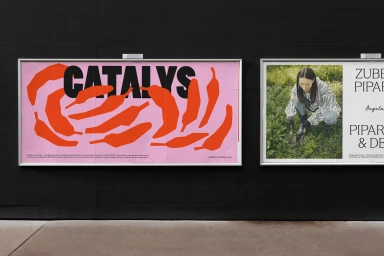
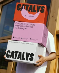
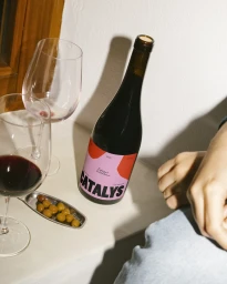
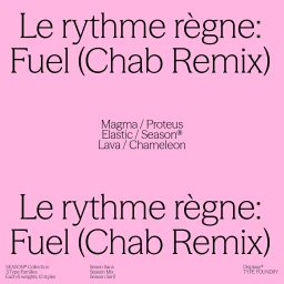
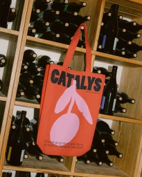
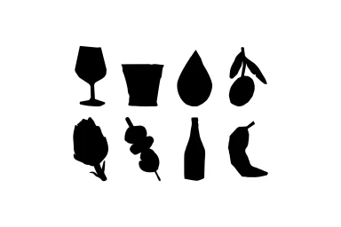
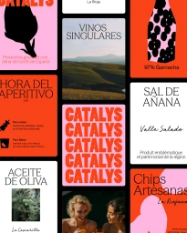
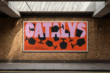
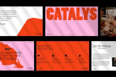
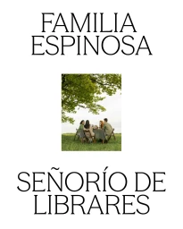
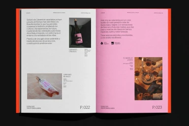
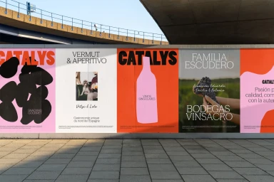
The brand identity for Catalys, executed by The Woork, establishes a modern, high-contrast visual language that leans into bold typography and a vibrant color palette of orange, red, and pink. The work translates across various touchpoints, including outdoor advertising, custom packaging, and editorial magazine spreads, maintaining a consistent aesthetic through structured grid systems and minimalist iconography. Techniques such as motion graphics and graphic vector design bring the identity to life, transitioning from static posters to dynamic animated sequences that highlight the brand's typographic versatility. By balancing clean negative space with striking photographic insets and artisanal product labels, the design provides a cohesive framework for the brand's food and beverage offerings.
Commercial, Graphic
Typography
