
Camelot tells a legend instead of a view: Brand Identity




Aug 2026
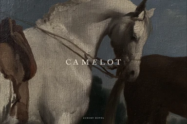
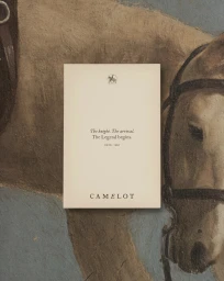
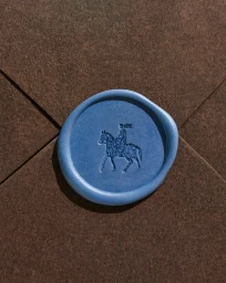
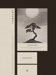
In a refreshing departure from the conventional, high-gloss imagery synonymous with destination marketing, the latest brand identity for Camelot leans into an evocative narrative that prioritizes the spirit of place over the traditional postcard view. By centering on the quiet, visceral textures of the natural world, the project successfully bridges the gap between tourism boards and artistic storytelling. A standout piece in the collateral features a singular, weathered agave stalk set against the hazy, infinite blue of an overcast ocean, an image that epitomizes the campaign's minimalist aesthetic. This choice of focus—an organic, tactile relic framed by the vastness of the sea—signals a move toward a more sophisticated, restrained visual language. The execution relies heavily on a warm, analogue film aesthetic that feels deeply rooted in memory rather than immediate consumption. With expert design from Arkadë Studio and precise print production by Alsagraf, the brand identity creates an atmosphere of stillness that invites a deeper, more meditative engagement from the audience. By eschewing typical travel tropes, Camelot crafts a visual landscape that feels both grounded and expansive, proving that the most compelling invitations to travel are often those that whisper rather than shout, using carefully considered, organic imagery to leave a lasting, thoughtful impression on the viewer.
Minimalist, Vertical
Typography


