
Café Ephemera: Brand Identity





Feb 2026
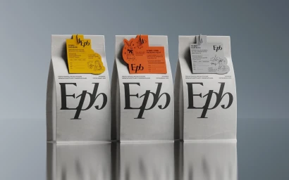
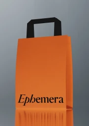
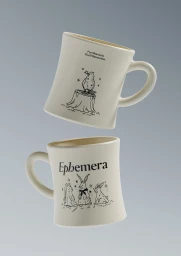
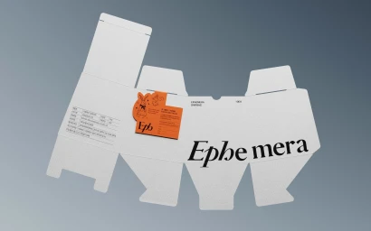
The brand identity for Café Ephemera serves as a masterclass in editorial minimalism, grounding the coffee experience in a sophisticated visual language that favors restraint and narrative detail. Executed through the collaborative expertise of STUDIO OKGO, which helmed the project’s design, motion, and illustration components, the identity system translates the brand’s essence into a cohesive suite of commercial assets. The visual strategy centers on a clean studio aesthetic, where white ceramic, matte paper packaging, and dark cold brew bottles are elevated by bold serif typography and intricate, whimsical line art. These illustrations—featuring stylized rabbits, owls, and organic motifs—bring a sense of playfulness to the refined, professional design architecture. Utilizing studio strobe techniques to ensure crisp highlights and precise shadows, the imagery leans into a high-end, cinematic quality that highlights the tactile nature of the materials, from the textured product tags to the metallic sheen of branded cutlery. By integrating 3D render and CGI elements, the project maintains a seamless consistency across all touchpoints, whether in the flat-lay packaging templates or the macro product compositions. This identity successfully channels a quiet, thoughtful brand presence, positioning Café Ephemera as a destination that values both the art of the craft and the storytelling inherent in every carefully curated cup.
Commercial, Clean, Minimalist, Vertical
