
Cadmus: Brand Identity






Feb 2026
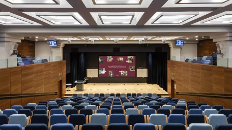
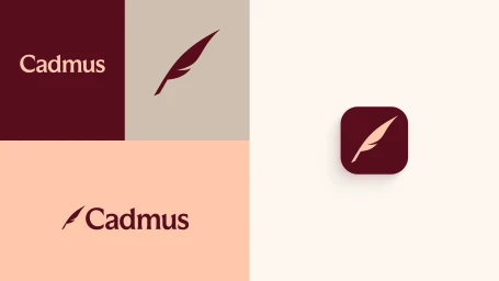
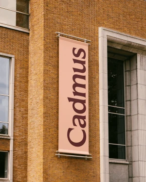
The brand identity for Cadmus represents a sophisticated evolution in the higher education assessment space, blending academic gravity with a contemporary, human-centric aesthetic. Executed with a disciplined color palette of dark maroon, soft cream, and muted beige, the visual system leans into corporate minimalism to establish trust and professional authority. Central to the identity is a stylized feather icon and an elegant serif typeface, which anchor the brand across a diverse range of touchpoints, from digital interfaces and environmental signage to collateral like tote bags and printed brochures. Lovework Studio serves as the primary force behind this cohesive design and illustration language, successfully marrying high-end editorial layouts with utilitarian graphic design. The project incorporates dynamic elements including motion work from Mansur Amiri and web development by Carl Beaverson, ensuring that the brand feels as agile on a mobile screen as it does on an outdoor billboard. By utilizing natural light and high-quality photography, the team creates a warm, inviting atmosphere that reflects the platform's focus on student empowerment. This comprehensive project successfully balances complex academic information with clean typography and vector precision, demonstrating how thoughtful brand identity can transform institutional messaging into a modern, recognizable, and highly engaging visual experience that feels both authoritative and remarkably approachable in a competitive landscape.
Clean, Horizontal, Commercial


