
Brandpad: Brand Identity
Jun 2020
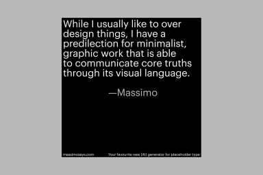
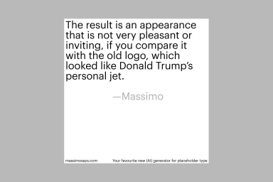
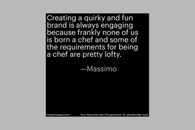
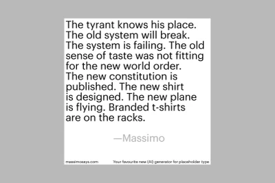
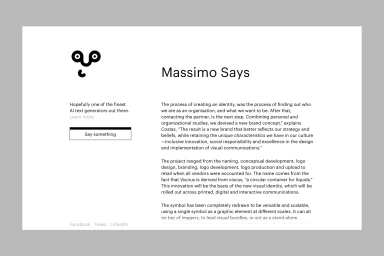
Brandpad establishes a definitive digital presence with its latest brand identity project, Massimo Says, a collection that merges corporate communication with high-concept design theory. Operating within the Apps and Digital Platforms industry, the project leans heavily into minimalist aesthetics to bridge the gap between abstract creative philosophy and functional UI illustration. The visual language is anchored by a series of graphic compositions that utilize bold black and white squares, employing a strict typographic hierarchy that forces the viewer to engage directly with the textual content. By stripping away extraneous decorative elements, the team allows the typography to function as the primary artistic vehicle, reflecting a sophisticated, editorial approach to digital branding. Each component, from the sharp contrast in the vector-based layouts to the deliberate application of serif and sans-serif fonts, serves to reinforce a cohesive, modern narrative. The project expertly balances the cold, structured nature of corporate web design with a human-centric focus on creative storytelling. Through this integration of minimalist commercial design and rigorous attention to layout, Brandpad creates a platform that feels both accessible and deeply intellectual. The resulting output is a clean, grid-based system that honors the principles of classic graphic design while remaining perfectly suited for a contemporary, fast-moving digital landscape, proving that true brand resonance often lies in the elegance of absolute simplicity.
Square, Minimalist, Clean, Commercial
Typography
Website / Web
