
NADO
Brand Identity
May 2026
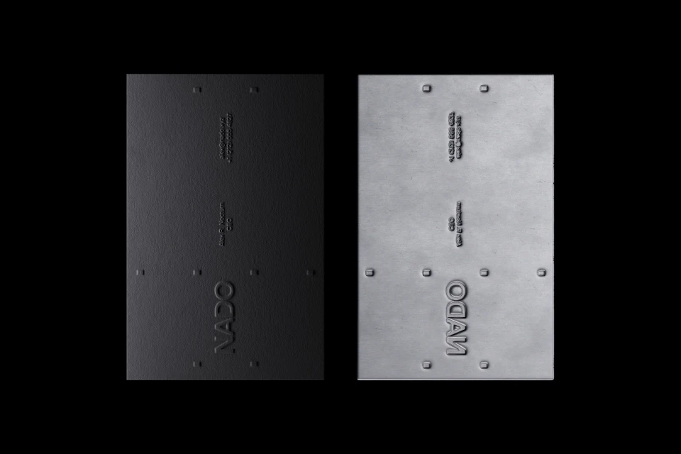
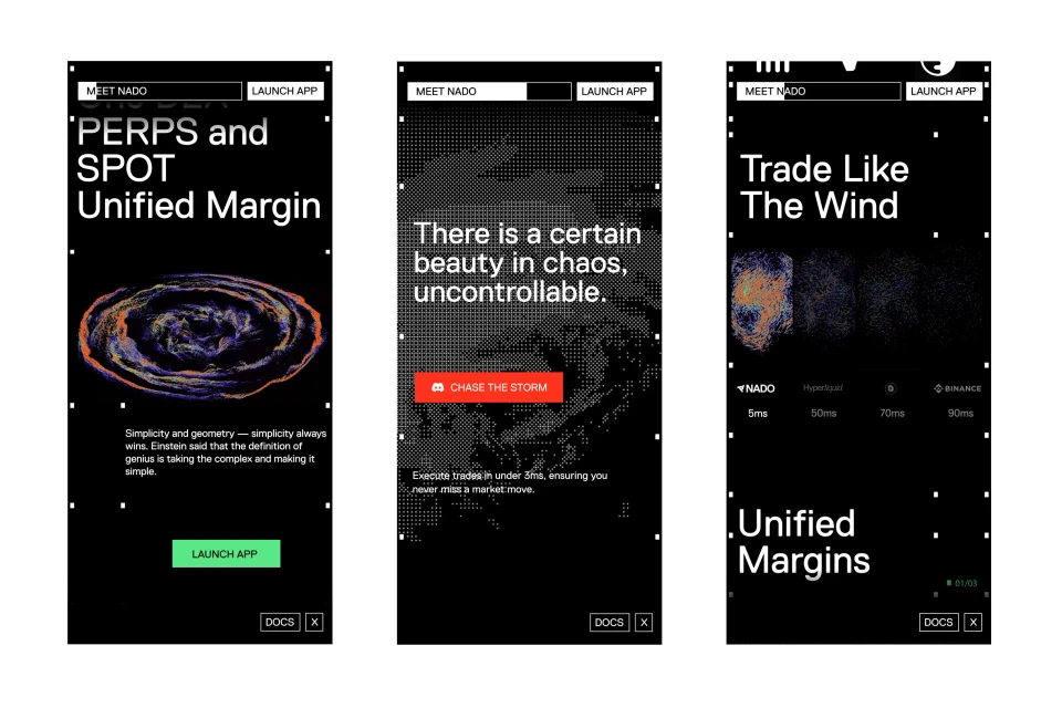
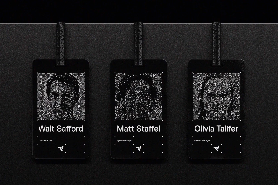
The brand identity for NADO establishes a sophisticated language for the high-performance finance sector, seamlessly blending industrial rigor with modern digital utility. At its core, the project navigates the tension between structural permanence and the fluidity of market data through a strictly monochromatic aesthetic. The design relies on high-contrast typography and utilitarian motifs, such as the embossed structural rivets seen on physical assets, to ground the brand in a tactile, grounded reality. This material quality is juxtaposed against a sleek, tech-focused interface that features abstract data particle visualizations, effectively translating complex financial tools into a premium user experience. By integrating UI illustration and vector elements with advanced animation and CGI, the identity transforms technical documentation into a compelling narrative of speed and precision. The visual strategy is unified across both physical collateral and digital platforms, utilizing a clean, corporate sensibility that favors minimalist layouts and stark, high-contrast call-to-actions. With design contributions from ESTUDI-IMAGE, ffforum, and Teti Martinez, alongside technical implementation from web developers Kalok Yeung, Dianne van der Hoeven, and Bohdan Kuzmich, the brand succeeds in creating a cohesive, professional ecosystem. This project demonstrates how thoughtful design can humanize technical systems, using fine art sensibilities and AI-driven experimental textures to define a forward-looking visual identity for the modern financial landscape.
Horizontal, Commercial, Clean
Motion Graphics
Brand Film / Corporate Video


