
Creative teams
Brand Identity
May 2026
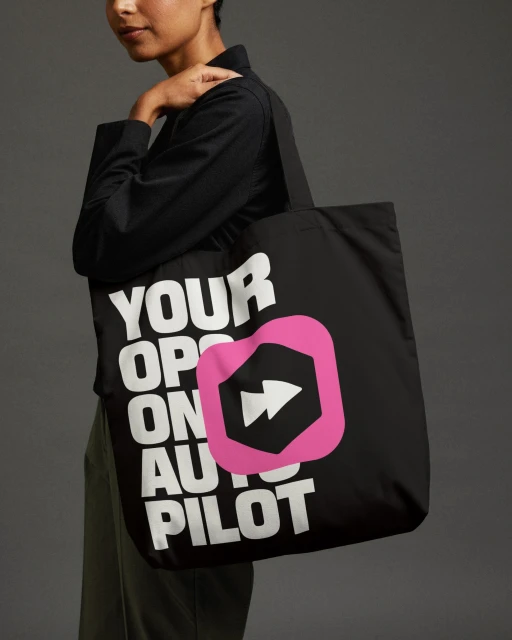
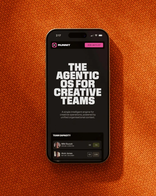
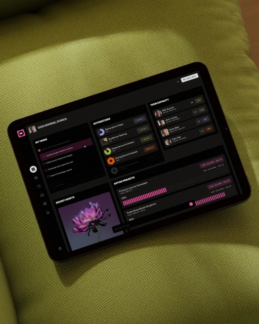
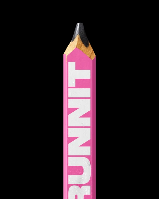
The brand identity for Runnit bridges the gap between tactical productivity and high-concept creative output, defining the platform as an essential agentic operating system for modern collaborative teams. Through a disciplined visual language, the project masterfully balances digital efficiency with tactile, grounded aesthetics. The execution leans into a clean, minimalist corporate identity that avoids the sterile tropes typical of project management software. Instead, it utilizes a sophisticated dark-mode UI, punctuated by deliberate, vibrant pink accent colors that signify movement and precision. The technical execution, captured through meticulous studio strobe lighting and crisp macro photography, elevates mundane office tools—like a custom-branded pencil or a canvas tote bag—into icons of a professional culture defined by bold, sans-serif typography. By placing digital interfaces onto rich, textured surfaces like burnt-orange fabric or olive-green upholstery, the work creates a compelling contrast between the cold precision of software and the warmth of a designer’s workspace. Design lead Robert James Powell anchors the aesthetic in a rigid yet expressive grid, while motion designer Michaela Day brings life to the platform’s fluidity through essential animation layers. This project serves as a masterclass in modern commercial branding, proving that even the most functional toolsets benefit from an editorial approach to visual storytelling and highly structured, high-contrast graphic design.
Vertical, Clean, Commercial
Apps & Digital Platforms

