
Balense: Brand Identity



Oct 2026
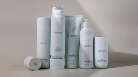
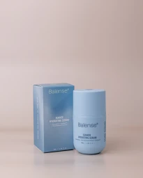
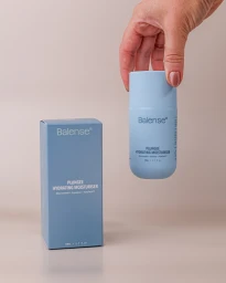
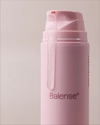
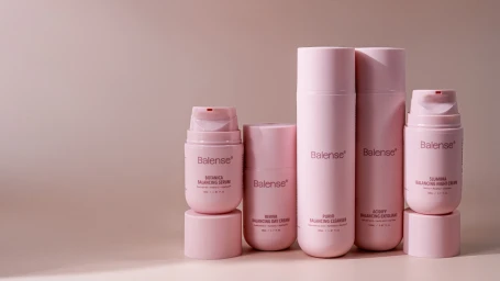
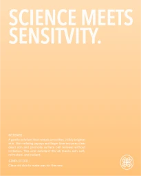
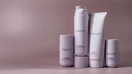
Balense establishes its visual presence through a comprehensive brand identity project centered on a clean, minimalist aesthetic. The work spans product photography and promotional collateral, utilizing soft directional lighting and a muted, contemporary color palette to highlight the matte textures of the packaging. Design agency Willow & Blake developed the typographic framework, pairing bold, sans-serif elements with an organized layout to convey a sense of clinical professionalism. The visual strategy leans into commercial photography that features both controlled studio arrangements and natural light portraiture to evoke purity and precision. By utilizing monochrome settings and neutral gradients, the imagery emphasizes the functional design of the containers across the skincare range. The project reflects a consistent, polished approach to beauty marketing.
Commercial, Clean, Minimalist, Vertical
E-commerce / Product

