
Bolimówek: Brand Identity





Brand
Date
Jan 2023
Description
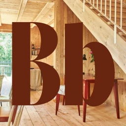
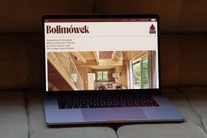
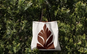
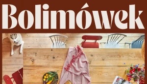
Bolimówek introduces a comprehensive brand identity system centered on a palette of earthy tones and organic motifs. The project, designed by Tinge, employs a minimalist aesthetic that bridges tactile print applications with structured digital touchpoints. The visual language leans into a clean, geometric approach, utilizing bold serif typography and refined botanical illustrations. These elements appear across a diverse range of deliverables, from product mockups and interior-inspired editorial layouts to website design and stationery. By balancing negative space with a cohesive vector graphic style, the identity emphasizes a warm and rustic sensibility throughout its commercial applications.
Style
Minimalist, Commercial, Horizontal
Color
Chocolate
Associated creatives

5000+ creatives to discover
Sign up to gain access to the entire directory. It’s free.
Visie is a curated library of creative professionals.