
Bobbi's
Brand Identity
Mar 2026
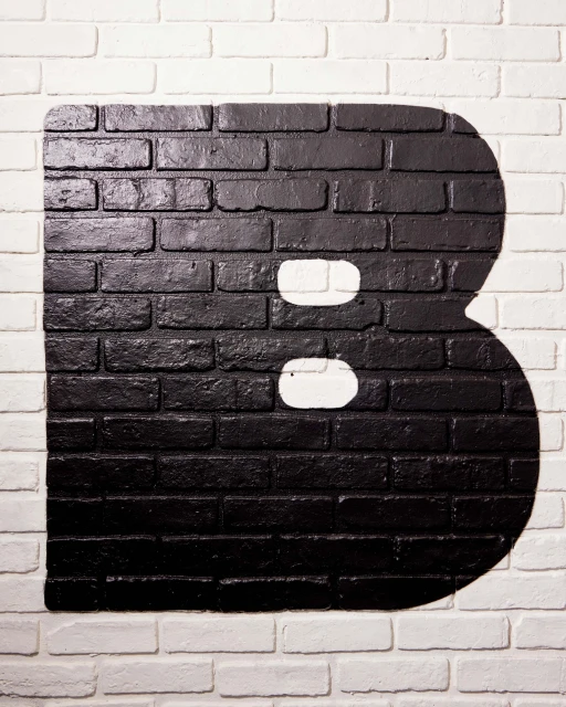
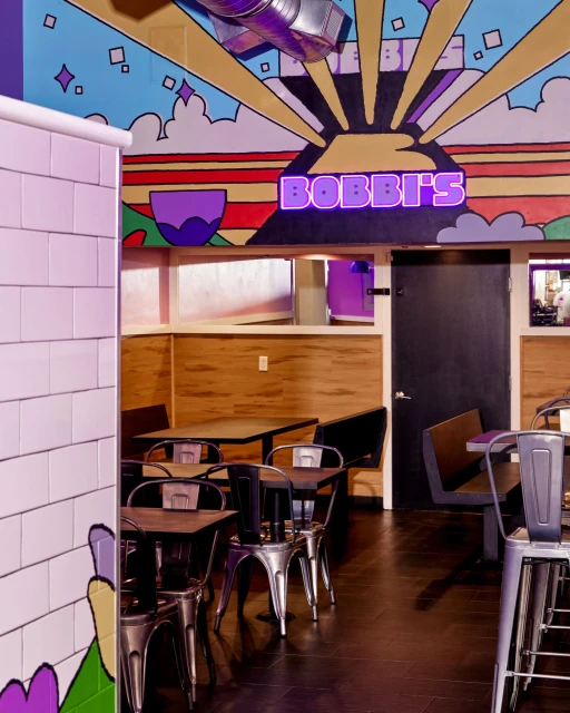
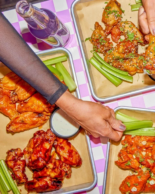
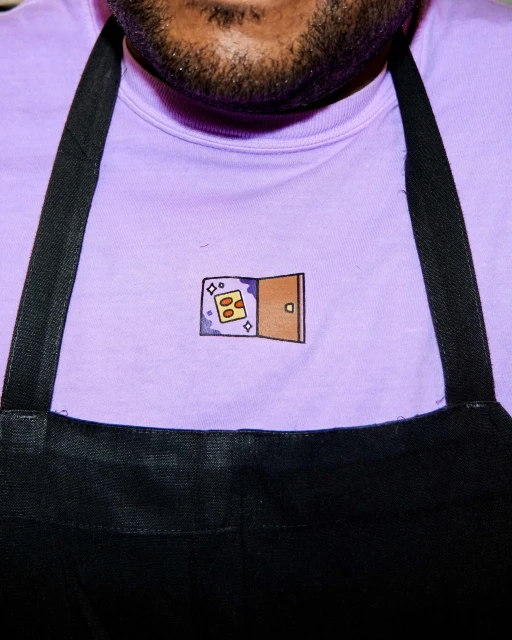
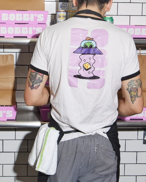
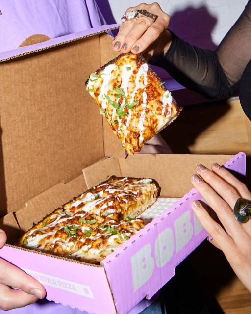
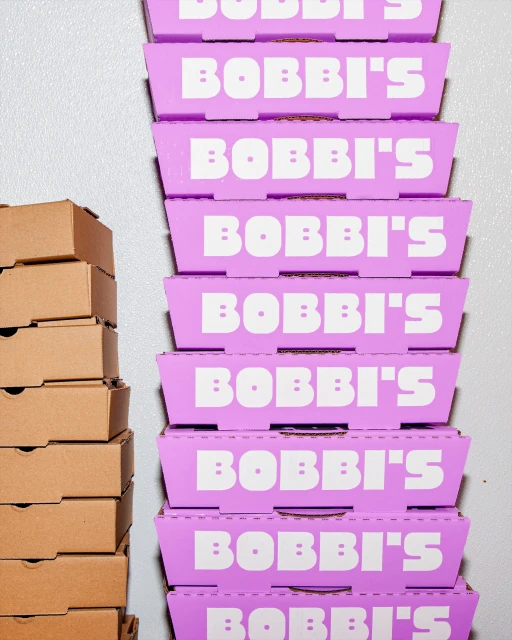
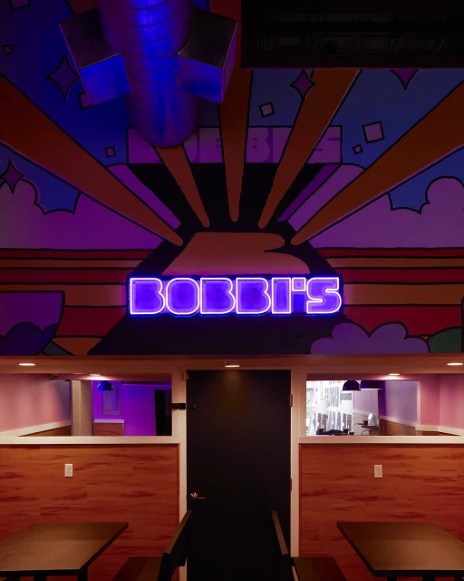
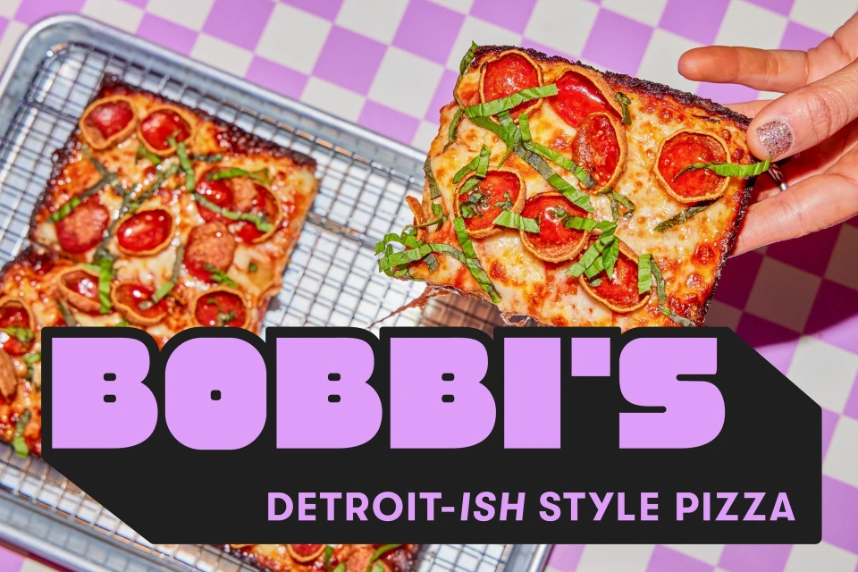
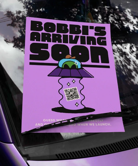
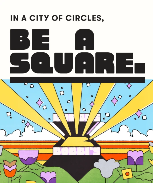
The brand identity for Bobbi's is a masterclass in modern, playful visual communication within the food and beverage industry. Moving far beyond the typical rustic tropes of a local pizzeria, the project leans into a vibrant, pop-art-inspired aesthetic that feels both whimsical and calculated. Through a cohesive design strategy led by the team at Box Eight, the brand utilizes a saturated color palette of electric purple, bold yellow, and sharp black to create an unmistakable presence. This identity project effectively anchors itself in commercial design, utilizing high-impact typography and graphic illustrations to bridge the gap between traditional dining and a contemporary, lifestyle-driven experience. The visual execution, expertly captured by photographer Amelia Ingraham, oscillates between high-key natural light lifestyle imagery and cinematic, interior-focused photography that highlights the restaurant's unique spatial personality. From the retro-futuristic UFO iconography on staff apparel to the bespoke, bold lettering painted across architectural surfaces, every touchpoint is meticulously considered. The use of vector-style illustrations and clever, square-focused messaging—exemplified by the mantra to be a square in a city of circles—reinforces a brand that is confident, unconventional, and inherently memorable. By blending clean graphic design with the messy, tactile reality of food photography, Bobbi's establishes a distinct, energetic voice that resonates across both digital platforms and the physical dining space.
Vertical, Commercial

