
Black Movie: Brand Identity

May 2019
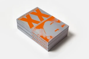
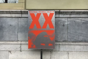
For its milestone 20th edition, the Black Movie festival demanded a visual presence that felt as dynamic and urgent as the independent cinema it celebrates. The resulting brand identity, executed with precision by Neo Neo, masterfully bridges the gap between high-art aesthetic and functional commercial design. By leaning into a striking color palette of vibrant orange and deep red set against stark, reflective silver, the design language immediately commands attention within the busy landscape of the media and entertainment industry. Central to this approach is the use of bold, oversized typography, which anchors the various collateral pieces—from minimalist promotional brochures to large-scale exterior posters. The interplay of halftone portraiture and high-contrast silhouettes adds a layer of depth that prevents the clean, geometric graphic design from feeling overly clinical. Whether captured in a precise studio environment or applied to rustic stone architecture, the work maintains a rigorous consistency that defines the festival's forward-thinking spirit. This is commercial design that refuses to fade into the background; it acts as a visual anchor, effectively communicating the cultural significance of the event through deliberate, contemporary compositions. By stripping away extraneous noise, the team created an iconic identity that serves as both a functional tool for festival-goers and a bold artistic statement on its own.
Horizontal, Commercial, Clean
Typography
White Seamless
