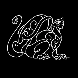
Biologica: Logo Mark
Aug 2026
In the fast-paced realm of apps and digital platforms, a brand identity is often defined by the precision of its kinetic expression. This latest motion project for Biologica serves as a masterclass in distilled branding, focusing on a sophisticated logo animation that bridges the gap between abstract artistry and functional clarity. Working alongside the creative team at Mythology, the agency has crafted a sequence that begins with a complex, tactile typographic treatment where letterforms appear rhythmically compressed and intentionally abstract. As the animation evolves, these kinetic shapes fluidly resolve into a sharp, legible sans-serif typeface, anchoring the brand within the viewer’s consciousness against a stark, high-contrast dark background. This commercial project relies on a strictly monochromatic color palette to drive home its message of technical innovation, ensuring that the identity stands out through sheer graphic austerity. By utilizing refined VFX and visual effects, the animation avoids unnecessary ornamentation, instead leaning into a minimalist aesthetic that feels both modern and authoritative. The motion sequence acts as a definitive reveal, demonstrating how a simple shift in form can encapsulate the entire narrative of a technology-forward brand. It is a bold, polished piece of design work that highlights the power of fluid motion to elevate a digital presence, successfully balancing complex visual transitions with the immediate requirement for brand recognition in a saturated marketplace.
Artistic, Vertical, Clean, Graphic
Motion Graphics
Black Seamless
Brand Film / Corporate Video