
Barkhouse
Brand Identity
May 2026
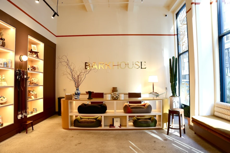
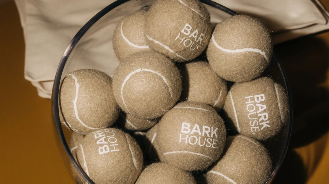
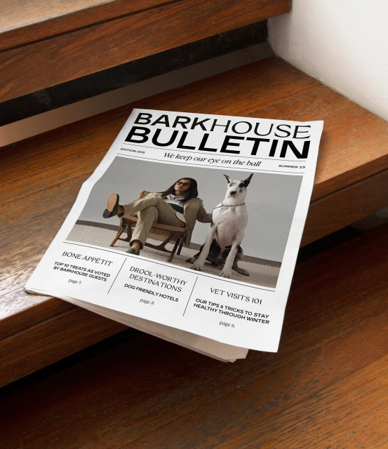
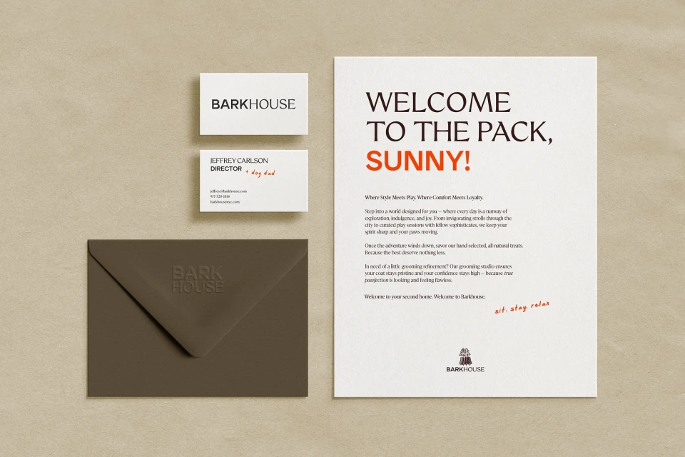
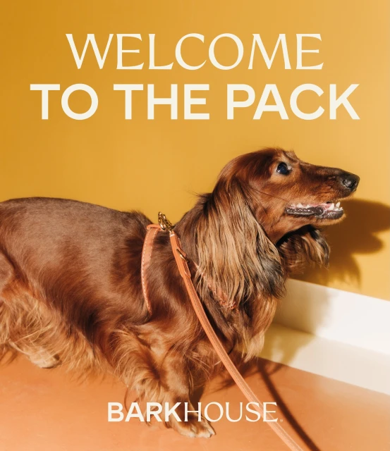
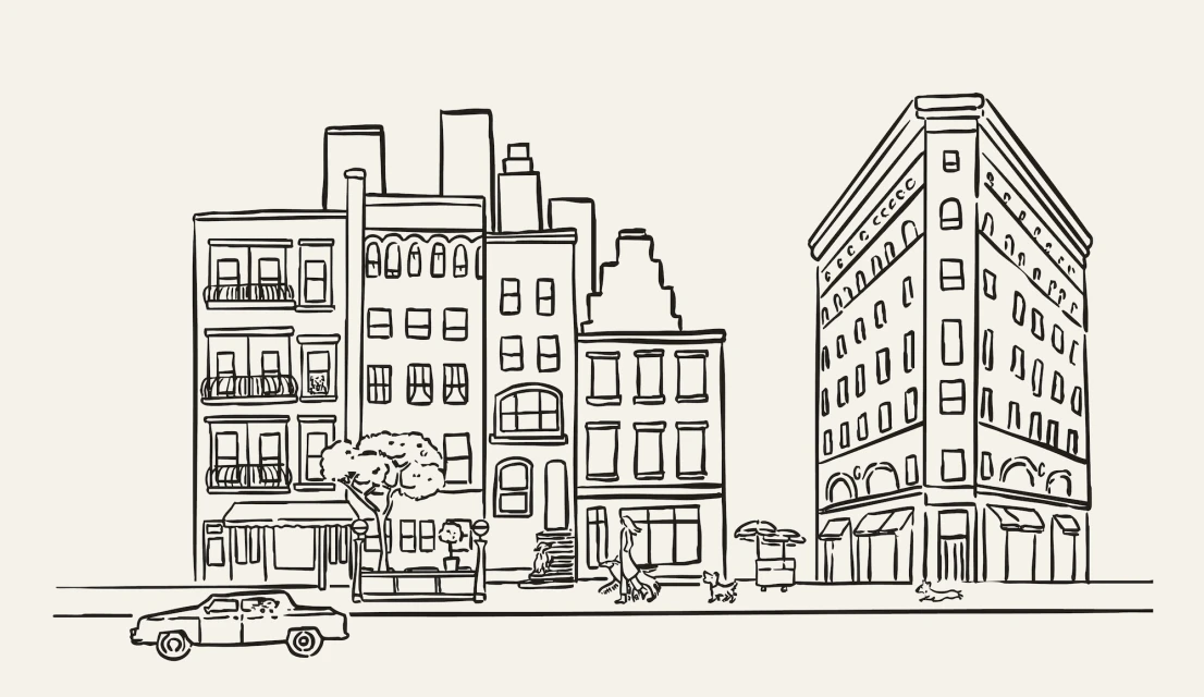
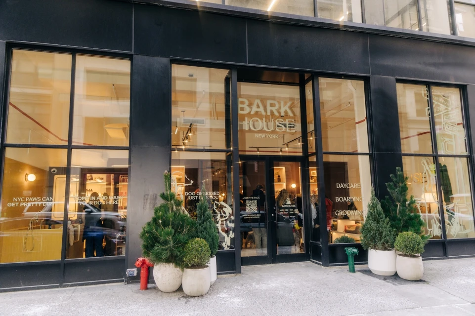
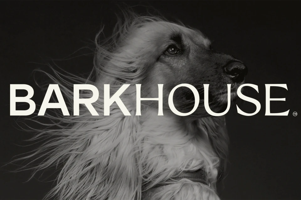
The brand identity for Barkhouse strikes a sophisticated balance between high-end corporate polish and the warm, welcoming spirit of a modern pet lifestyle brand. Moving beyond standard retail tropes, the visual system channels a refined, editorial minimalism that elevates the daily pet care experience. Crown Creative anchors the project with a versatile design language, utilizing a clean, modern typography suite and a distinctive color palette—characterized by mustard yellow, soft cream, and bold accent orange—that bridges the gap between commercial accessibility and boutique aesthetic. The identity is applied with surgical precision across multiple touchpoints, from the architectural integration of a prominent golden logo within their New York storefront to the textured, intentional compositions of the Barkhouse Bulletin. The project effectively leans into fine art illustration and cinematic portraiture to build a cohesive narrative; specifically, the interplay of low-key, chiaroscuro lighting in studio pet portraits creates a high-contrast editorial edge that defies typical pet industry conventions. By pairing these sophisticated studio techniques with structured, clean layout work on business collateral, Crown Creative has successfully established a scalable and professional brand architecture. The result is a highly tactile, dog-friendly environment that feels both professional and deeply personal, capturing a premium, community-focused ethos that resonates across both digital and physical retail landscapes.
Horizontal, Commercial, Clean
Advertising Campaign
