
as a family grew: Brand Identity
Apr 2026
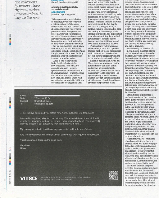
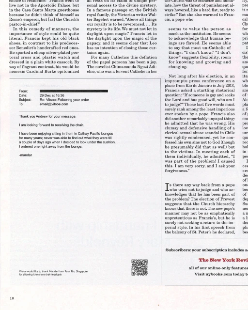
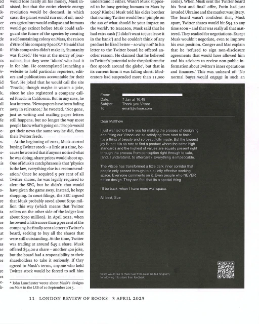
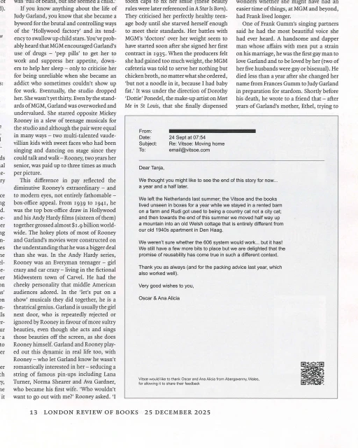
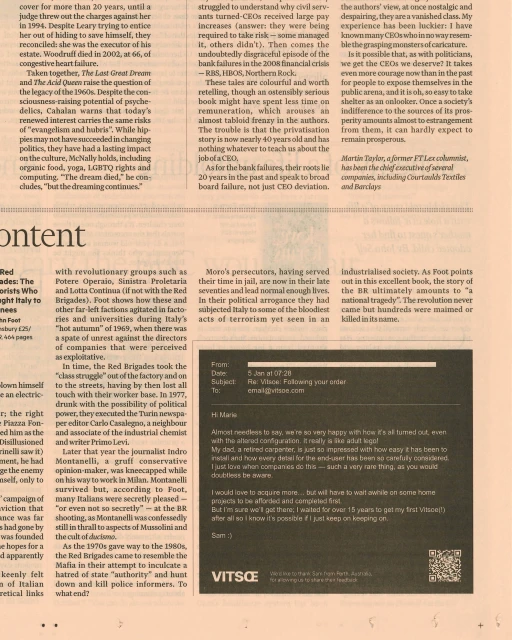
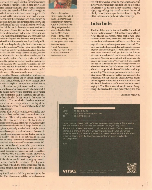
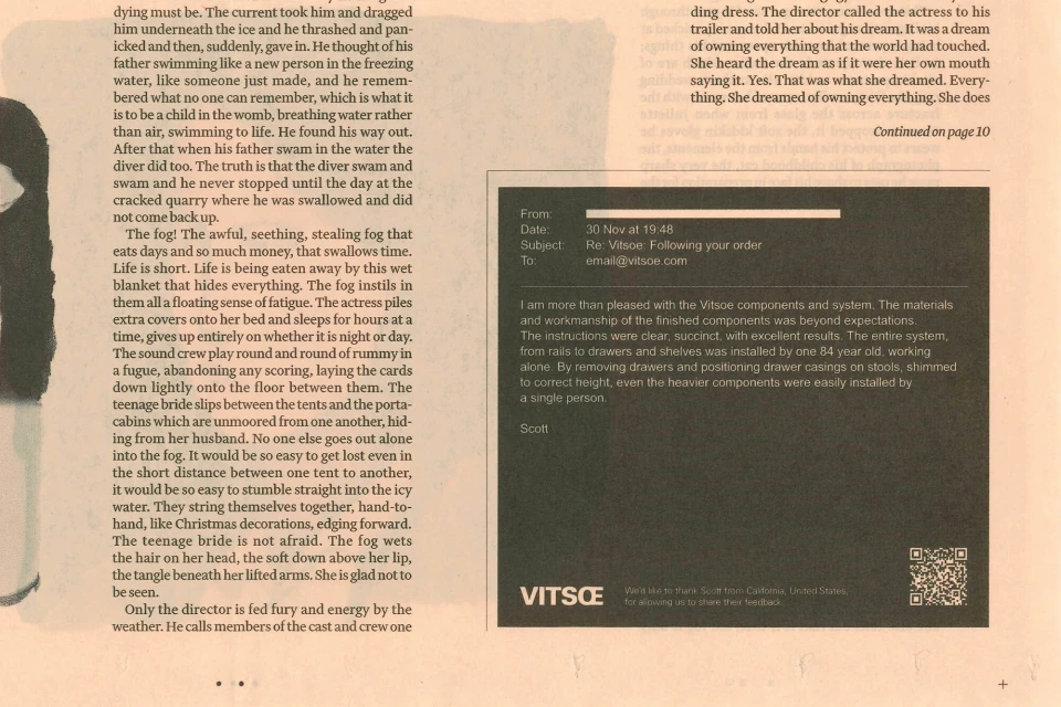
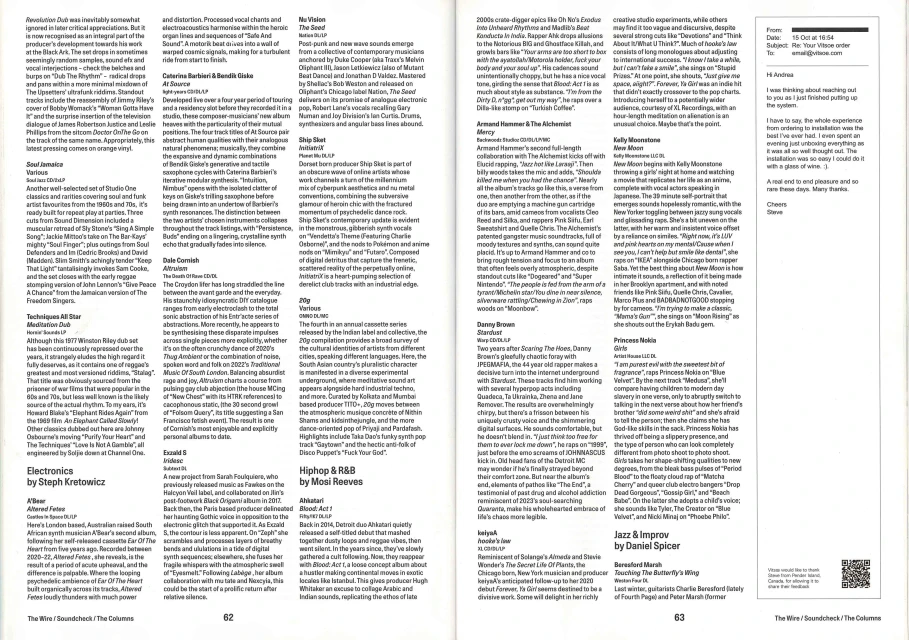
In the crowded landscape of digital media and publishing, the As a Family Grew brand identity project carves out a distinct space by masterfully blurring the lines between institutional documentation and high-end editorial design. By integrating genuine customer testimonials—reproduced as stark, dark-boxed typographical interventions—directly into the dense, serif-heavy columns of publications like the London Review of Books, the project adopts a sophisticated approach to corporate storytelling. This editorial-driven campaign avoids the artifice of traditional advertising, opting instead for a minimalist, text-first aesthetic that respects the medium it occupies. The execution is defined by its clean, high-contrast typography, where the technical precision of a QR code serves as the only nod to modern digital interaction. Throughout the series, the design leans into a classic publication layout that functions less like a commercial disruption and more like a narrative element within the page. By framing candid customer feedback alongside scholarly articles, the project manages to validate the product through the lens of lived experience, transforming routine correspondence into a compelling part of the reading journey. With creative design input from Vitsœ, the result is a masterclass in typographic restraint, proving that in a world of flashing banners and algorithmic noise, the most effective branding is often that which is quietly, thoughtfully embedded into the cultural dialogue.
Vertical, Graphic, Editorial
Typography
Paper Texture
