
Amperos
Brand Identity


Aug 2026
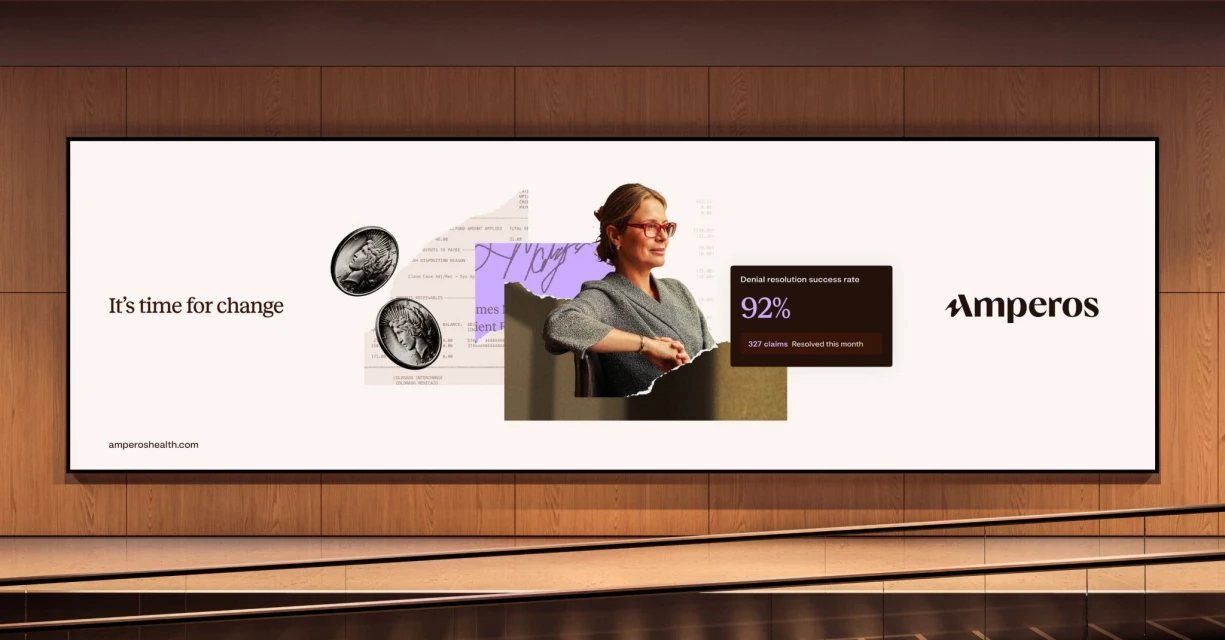
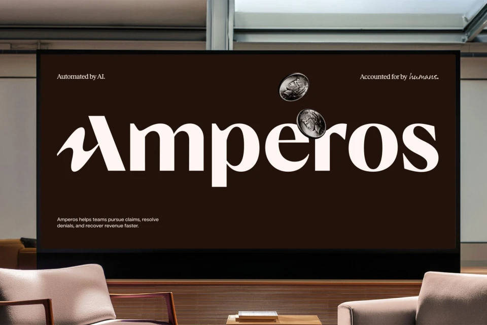
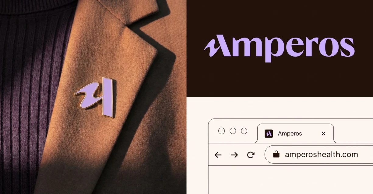
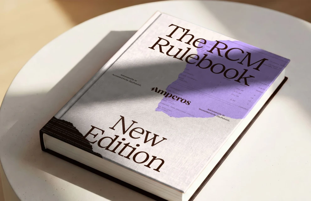
Amperos has unveiled a sophisticated new brand identity that masterfully bridges the gap between high-tech financial automation and human-centric service. Orchestrated by the design agency Together, this project redefines the corporate aesthetic for the insurance sector, leaning into a refined, editorial minimalism that prioritizes clarity and authority. The visual language is anchored by a striking, bold serif typeface and a distinctive stylized letter A, which appear across various touchpoints, from digital billboard advertisements to physical collateral like the meticulously crafted RCM Rulebook. The design team employs a sophisticated collage technique, layering financial documents with vintage-inspired icons—such as pocket watches, compasses, and keys—rendered in a stark black and white halftone print style. This conceptual approach suggests an investigative, detail-oriented narrative that transforms mundane financial metrics into compelling brand assets. Beyond the static print work, the identity excels in its digital execution, where UI illustration and clean, modern layouts create a seamless B2B experience. By integrating textural elements like purple and gold enamel pins on textured blazers alongside sharp, natural light product photography, the project grounds its digital-first messaging in tangible reality. The result is a cohesive and modern ecosystem that signals both corporate trust and professional agility, successfully positioning Amperos as an innovative leader within the financial services landscape through a thoughtful, design-led strategy that values aesthetic precision as much as functional performance.
Commercial, Horizontal, Clean
