
Aero: Brand Identity

Jun 2024
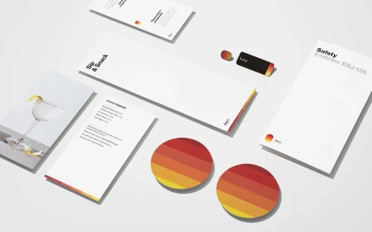
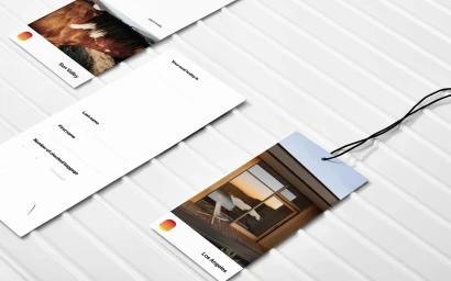
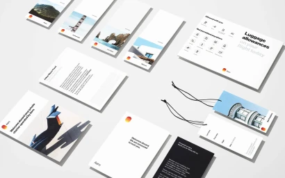
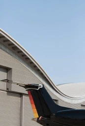
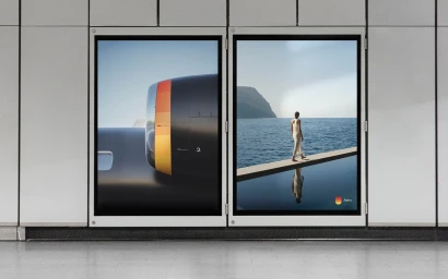
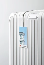
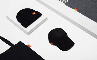
Aero’s brand identity project establishes a visual language defined by minimalist typography and a signature tricolor gradient of yellow, orange, and red. Designed by Otherness, the system spans both digital and physical touchpoints, including out-of-home advertising, custom travel collateral, and branded apparel. The project leans into a clean, modern aesthetic, utilizing motion graphics for outdoor digital displays and precise 3D rendering for product shots of travel accessories and boarding documentation. Imagery across the campaign highlights the brand's presence in the airlines and hospitality sectors, maintaining a consistent focus on geometric lines and high-contrast color application.
Commercial, Horizontal, Clean, Minimalist
Advertising Campaign
