3TEMP
Brand Identity
Apr 2026
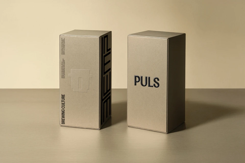
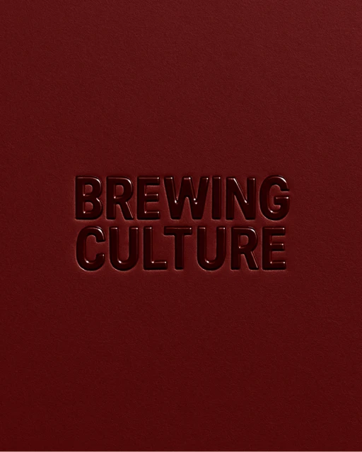
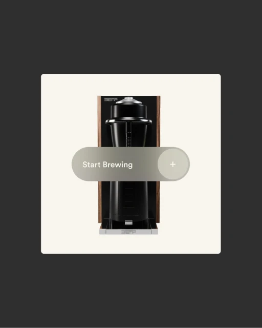
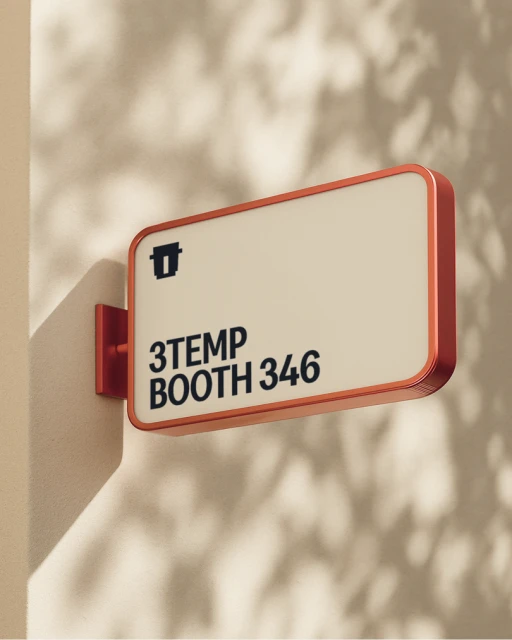
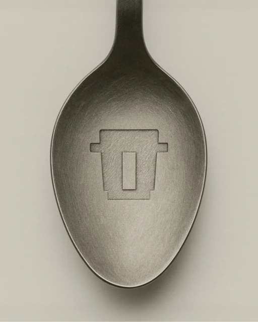
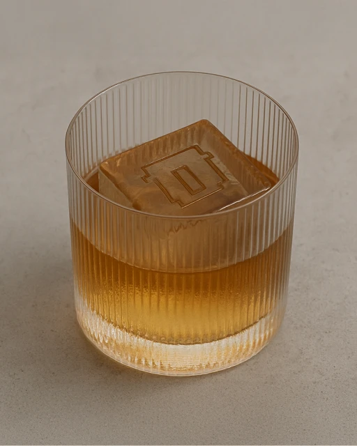
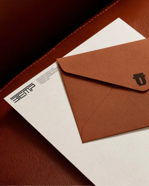
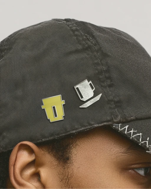
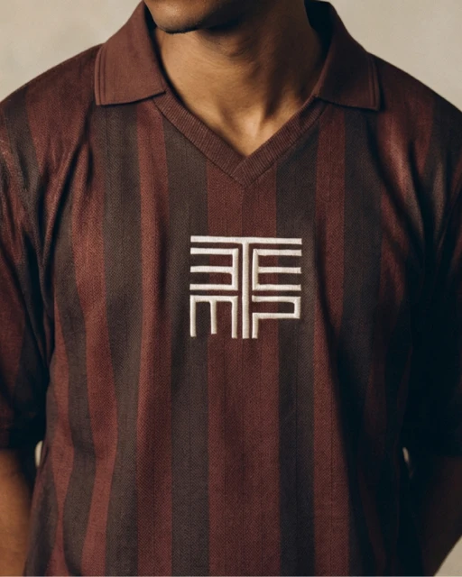
The brand identity for 3TEMP serves as a masterclass in modern commercial design, where industrial precision meets a deeply tactile visual language. Developed by Studio NARI, the project establishes a cohesive aesthetic that spans product packaging, signage, and high-end lifestyle apparel. By leaning into a sophisticated, minimalist palette, the design team effectively bridges the gap between functional corporate utility and artisanal craft. The execution makes extensive use of studio strobe lighting to emphasize the structural clarity of the typography and the materiality of the branded surfaces, from embossed paper stationery to etched metal spoons. A recurring theme of brewing culture is integrated seamlessly into the brand, appearing as subtle geometric icons on everything from lifestyle accessories like enamel pins and polo shirts to the ice cubes in a glass. This identity project leans into editorial minimalism, favoring clean, symmetrical compositions and a neutral color story that allows the subtle textures of leather, cotton, and matte finishes to take center stage. Whether captured through crisp macro photography or clean UI illustrations, the work presents 3TEMP not just as a coffee-related entity, but as a lifestyle brand defined by high-quality production standards. The result is a refined, cohesive brand system that feels both modern and grounded, signaling a clear commitment to excellence across every physical and digital touchpoint.
Commercial, Clean, Vertical