
Brand
ProjectBrand Identity
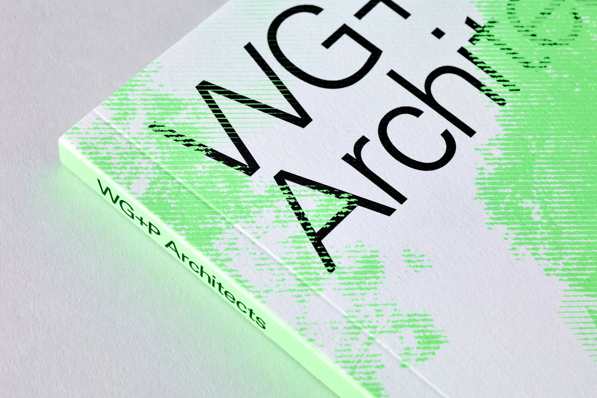
WG+P Architects Brand Identity 2020
Associated creatives

Tags
Description
This image showcases a close-up angle of a printed booklet spine and cover for WG+P Architects, part of their brand identity project designed by Studio Lowrie. The composition highlights crisp white paper stock featuring tactile texture, overlaid with bold black typography and distressed, textured lime green graphic elements. The lighting is clean and even, accentuating the fine grain of the paper and the sharp print finish. The perspective focuses tightly on the spine, revealing the clean crease and the subtle green text alignment along the edge.