
ProjectBrand Identity
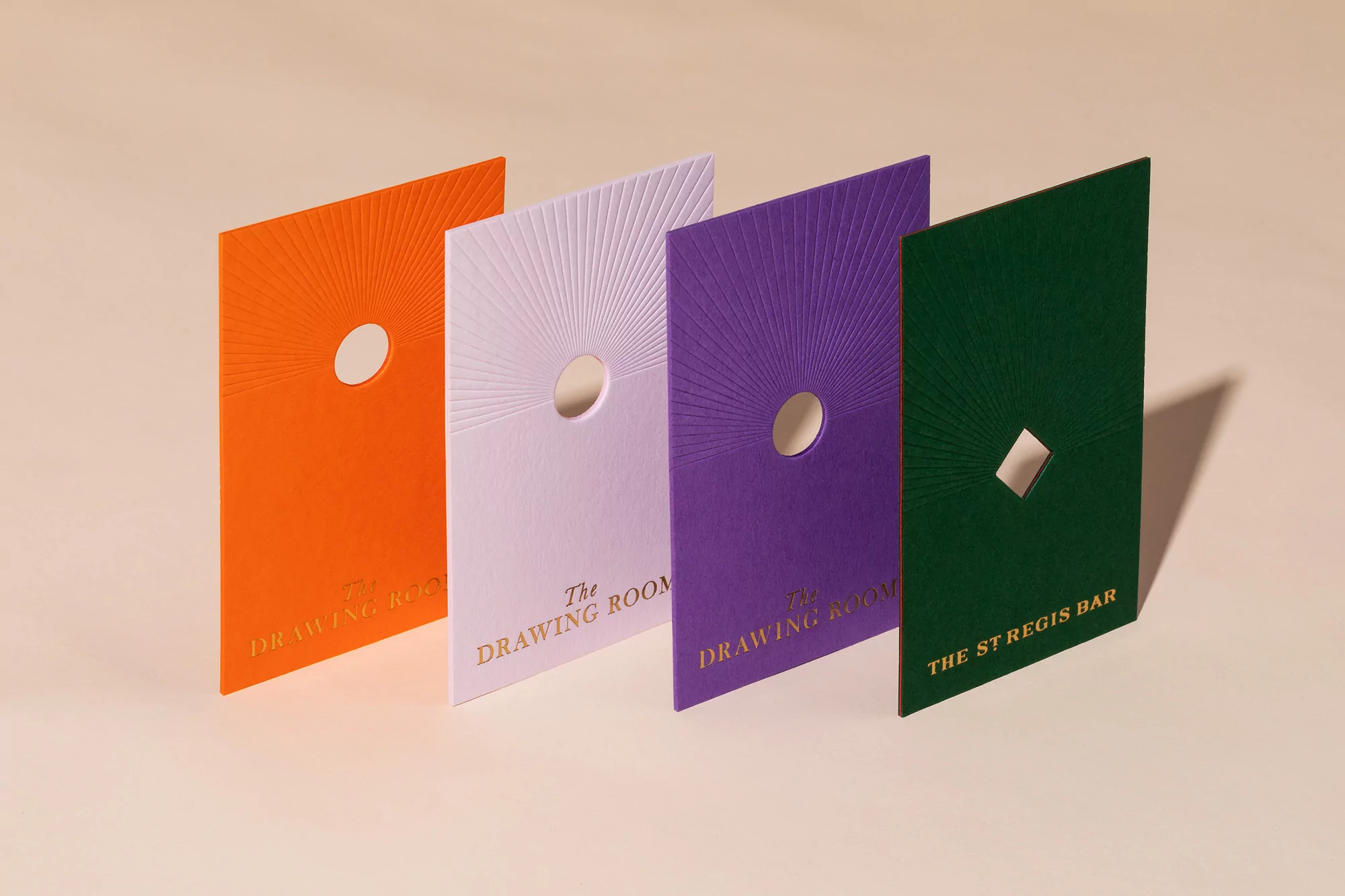
The St. Regis Hong Kong Brand Identity 2020
Associated creatives

Tags
Description
Graphic design showcase featuring four vertical cards arranged diagonally on a neutral beige background for The St. Regis Hong Kong brand identity project. The cards display vibrant colors of orange, lavender, purple, and dark green with tactile textured paper surfaces. Each card incorporates an intricate debossed sunburst pattern radiating outward from a circular or diamond-shaped die-cut aperture in the center. Gold foil typography at the bottom of each card reads text related to The Drawing Room and The St. Regis Bar. Clean, studio lighting casts soft shadows to the right, highlighting the dimensional relief and premium finish of the print collateral.