
Brand
ProjectBrand Identity
the beauty counter Brand Identity 2026
Associated creatives

Tags
Description
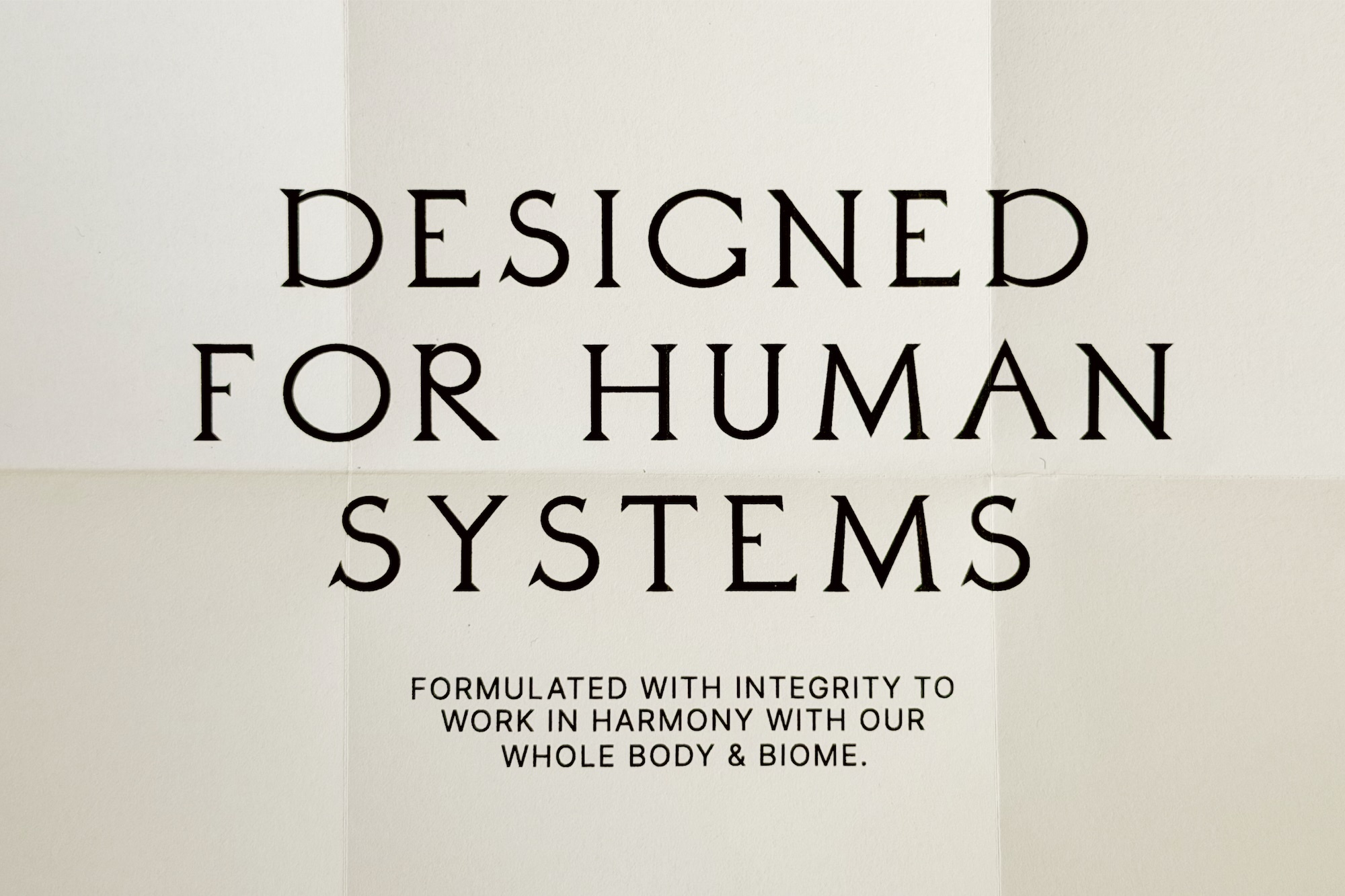
A minimalist brand identity print layout designed by Wedge for The Beauty Counter. Prominently centered across the off-white folded paper surface is the headline 'DESIGNED FOR HUMAN SYSTEMS' set in a high-contrast black serif typeface. Below the headline, a supporting manifesto statement is typeset in a clean, small-scale uppercase sans-serif font. Subtle horizontal and vertical fold creases segment the paper backdrop into a geometric grid, emphasizing tactile editorial print design.