
BrandT1 Energy
ProjectBrand Identity
T1 Energy Brand Identity 2026
Associated creatives


Tags
Description
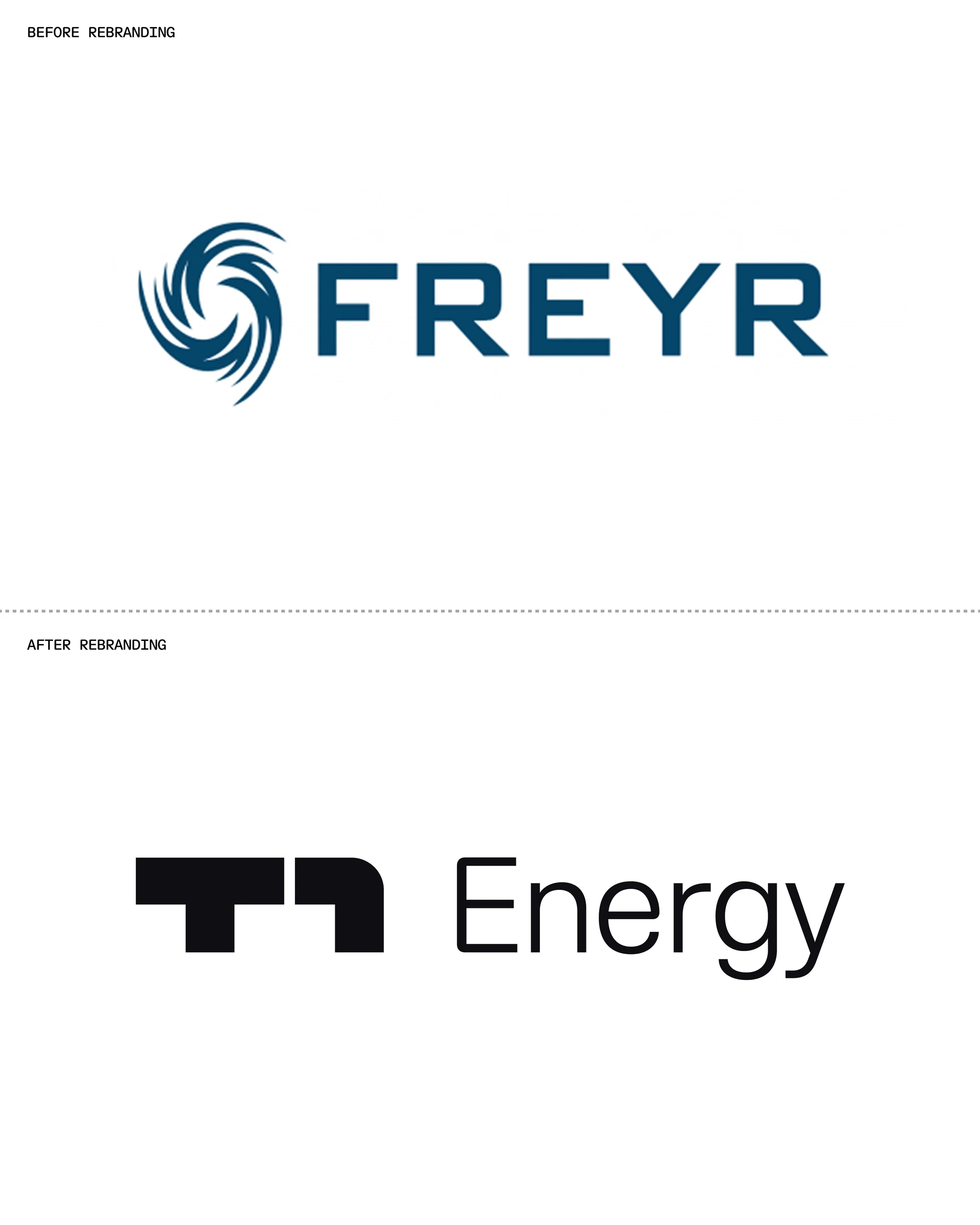
This brand identity project for T1 Energy displays a corporate rebranding case study featuring two distinct logo sections separated by a dotted line. The top section reads before rebranding with the blue Freyr wordmark and swirl graphic, while the bottom section shows the updated black T1 Energy logo and wordmark. Mouthwash Studio and Moniker handled the design and web development for the project. The layout is set against a clean white background with clear typography and minimalist composition.
Style
Artistic, Vertical, Clean
Techniques
Typography
Industries
Telecommunications
Color
Jet Black (50%)
Cobalt (50%)
Background
White Seamless
Context
Advertising Campaign