
BrandSt. Regis Cap Cana
ProjectBrand Identity
St. Regis Cap Cana Brand Identity 2025
Associated creatives

Tags
Description
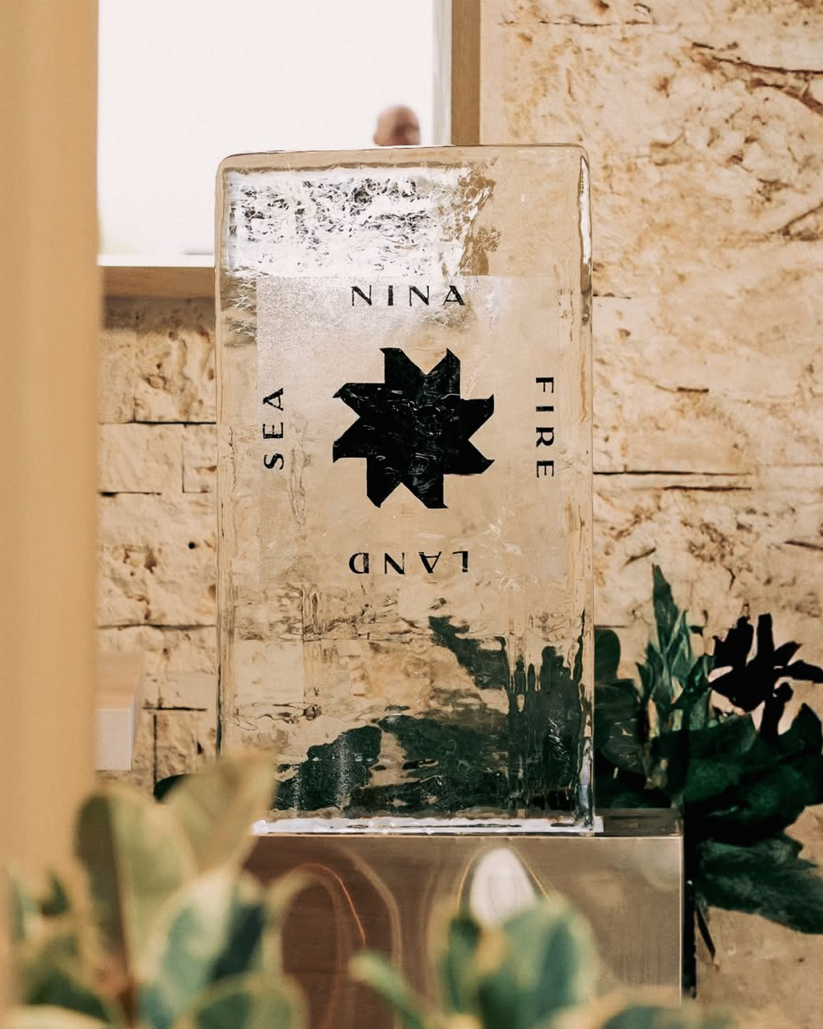
A tall, rectangular block of clear ice serves as the central display piece for St. Regis Cap Cana brand identity project by Crown Creative. Embedded within or printed on the ice face is a black geometric star symbol flanked by the words SEA, FIRE, LAND, and NINA. The sculpture stands on a reflective surface against a rustic stonewall background, framed by out-of-focus green foliage in the foreground. Natural lighting highlights the texture of the ice and the surrounding environment.
Style
Artistic, Vertical, Clean
Techniques
Natural light
Color
Jet Black (30%)
Pure White (70%)
Background
Stone Texture
Context
Advertising Campaign