
BrandSommerro Hotel
ProjectBrand Identity
Bielke & Yang, Graphic Design,
Associated creatives

Tags
Description
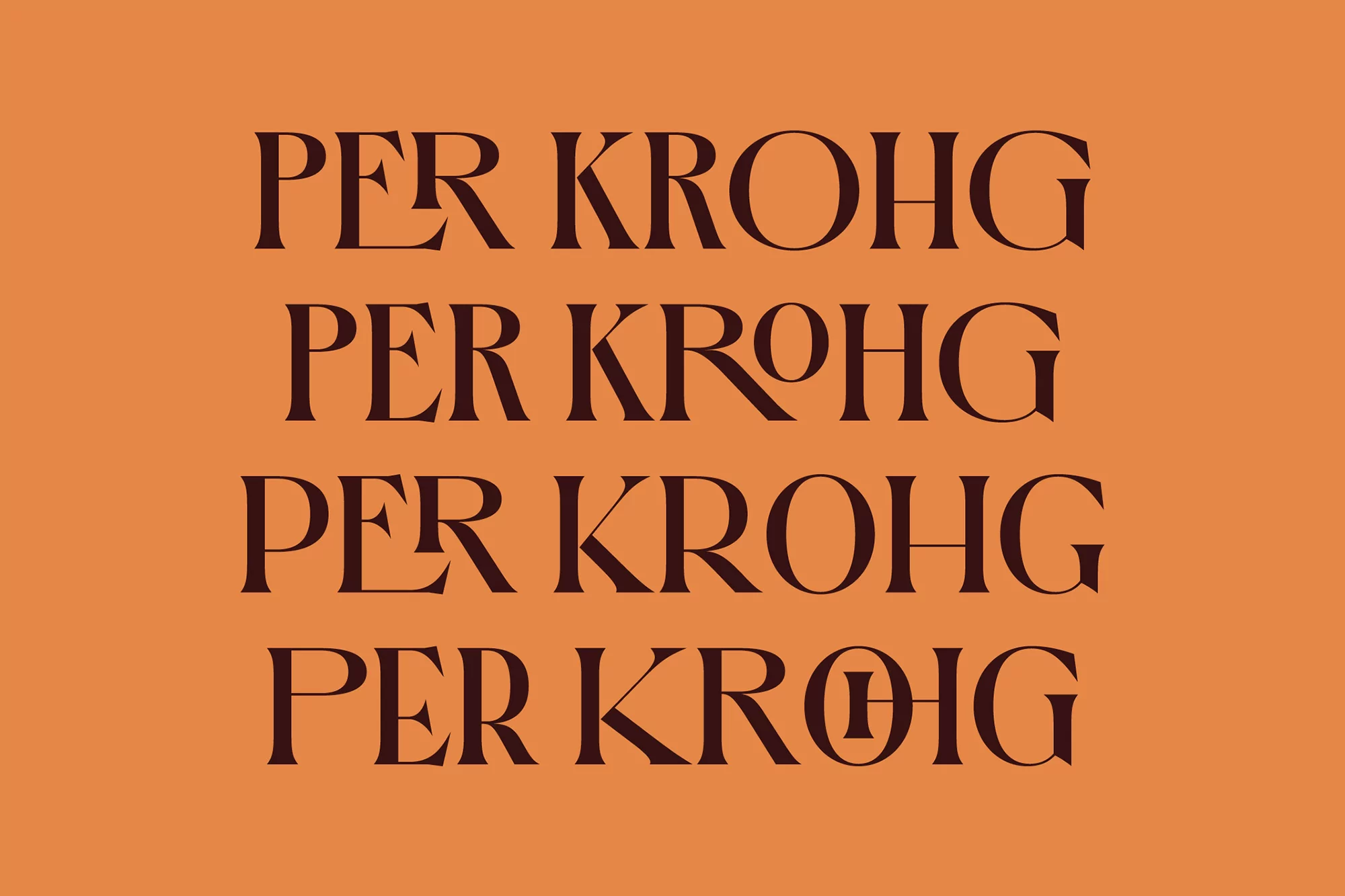
This graphic design image showcases a brand identity element for the Sommerro Hotel. The text Per Krohg is written four times in four separate rows using a sophisticated, high-contrast dark brown serif typeface. The font features elegant ligatures and geometric shapes, particularly in the letter O. The entire composition is set against a flat, solid muted orange background. The layout is clean and symmetrical, emphasizing the visual character of the custom lettering.
Style
Commercial, Corporate
Techniques
Typography
Industries
Hotels