
BrandSandra Diez
ProjectBrand Identity
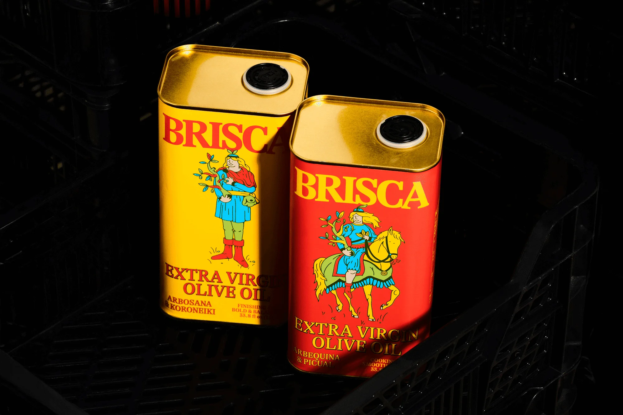
Sandra Diez Brand Identity 2025
Associated creatives


Tags
Description
Two rectangular metal extra virgin olive oil tins for Sandra Diez rest inside a dark textured crate under directional lighting. The tin on the left is bright yellow with red typography and a standing illustrated figure, while the tin on the right is vibrant red with yellow typography and an illustration of a figure on horseback. Both tins feature black circular caps on their metallic gold-tone top surfaces. The composition highlights the contrasting primary colors and detailed illustrative branding created for the project.
Style
Horizontal, Commercial, Clean
Techniques
Low-key / chiaroscuro
Industries
CPG / Packaged Food
Color
Crimson (50%)
Golden Yellow (50%)
Background
Black Seamless
Context
Advertising Campaign, E-commerce / Product