
Brand
ProjectBrand Identity
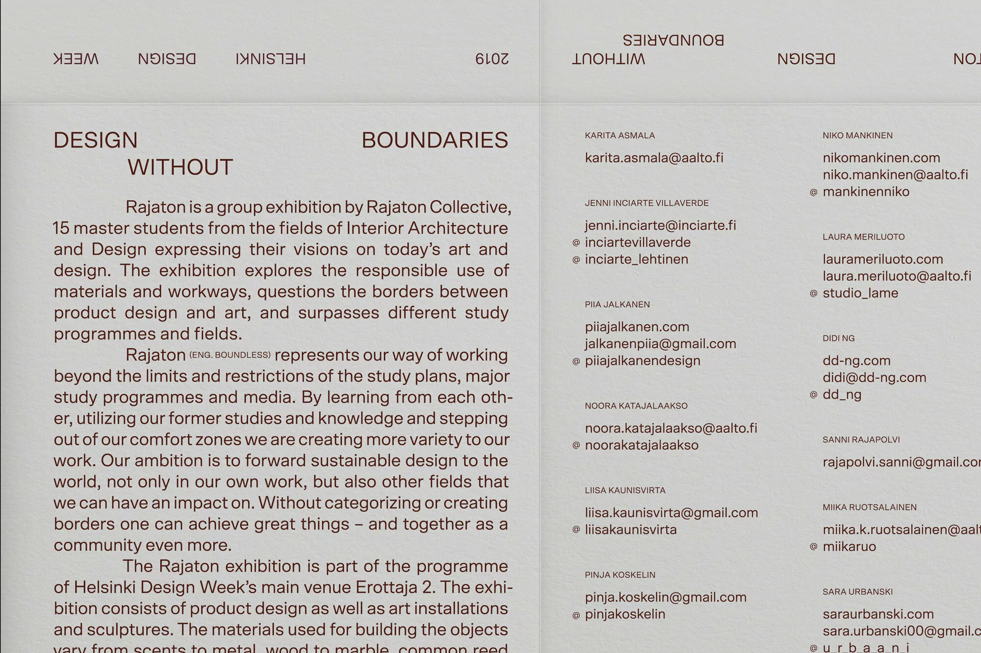
Rajaton Collective Brand Identity 2020
Associated creatives

Tags
Description
This graphic design piece presents the brand identity and exhibition layout for Rajaton Collective, created by Marina Veziko. The composition features structured columns of serif typography detailing the design philosophy and participant contact information against a tactile, neutral paper texture. Upside-down running headers frame the upper margin, while clean lines and disciplined spacing organize the textual content. The layout communicates a restrained and academic aesthetic suited for contemporary exhibition branding. The neutral palette and meticulous typographic hierarchy reflect a professional editorial approach.