
Brand
ProjectBrand Identity
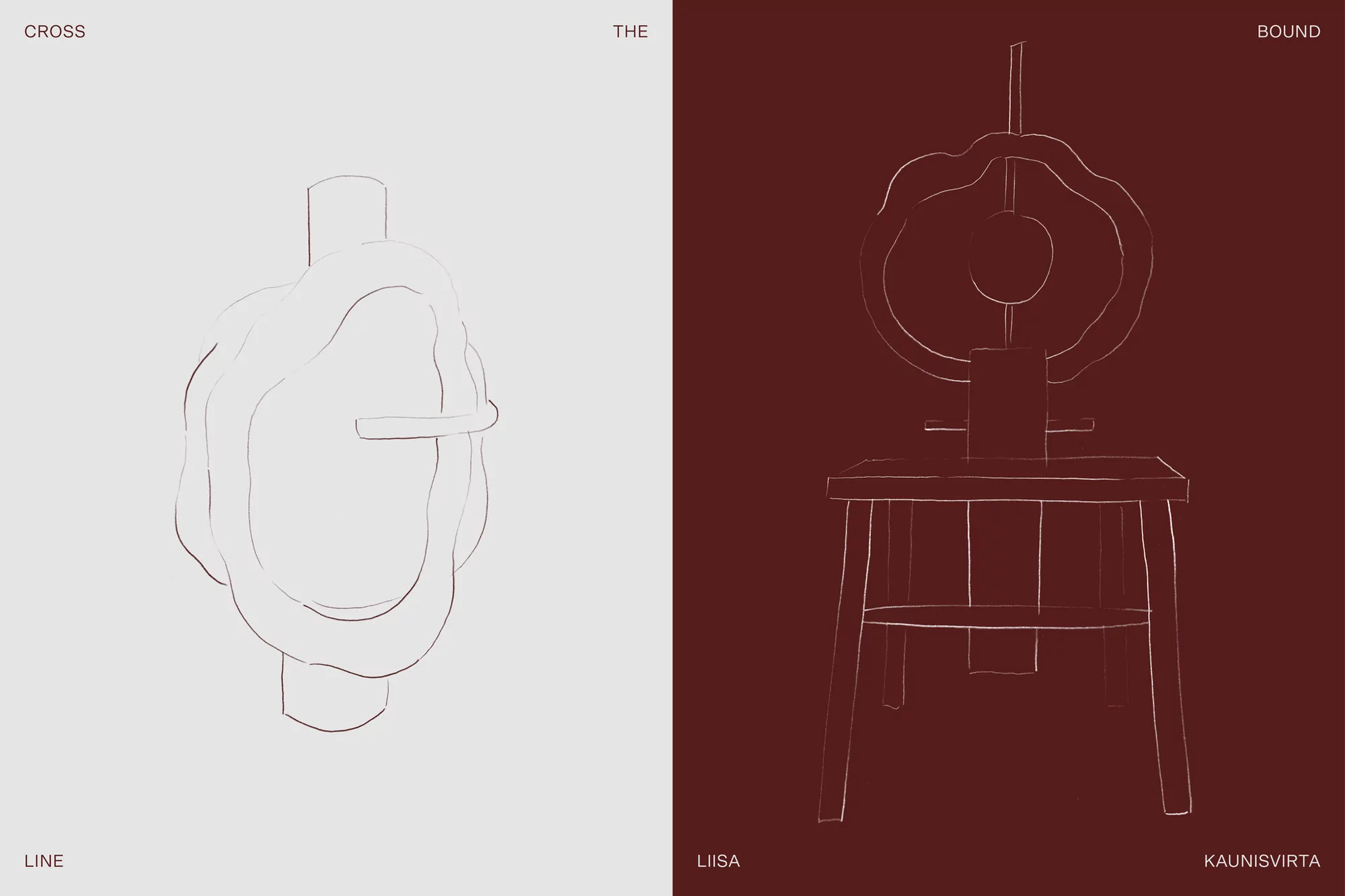
Rajaton Collective Brand Identity 2020
Associated creatives

Tags
Description
This graphic design piece presents a minimalist brand identity for Rajaton Collective, created by Marina Veziko. The composition is divided into two vertical panels creating a distinct color contrast between a pale grey-white background on the left and a deep burgundy background on the right. Both panels display delicate outline illustrations and typographic elements in complementary tones, including words such as cross, the, bound, line, liisa, and kaunisvirta. The left panel centers an organic, fluid looped contour, while the right panel depicts a structured, chair-like schematic emblem topped with circular line art. The overall aesthetic is clean, precise, and editorial.