
Brand
ProjectBrand Identity
Orchestra Kitchen Brand Identity 2021
Associated creatives

Tags
Description
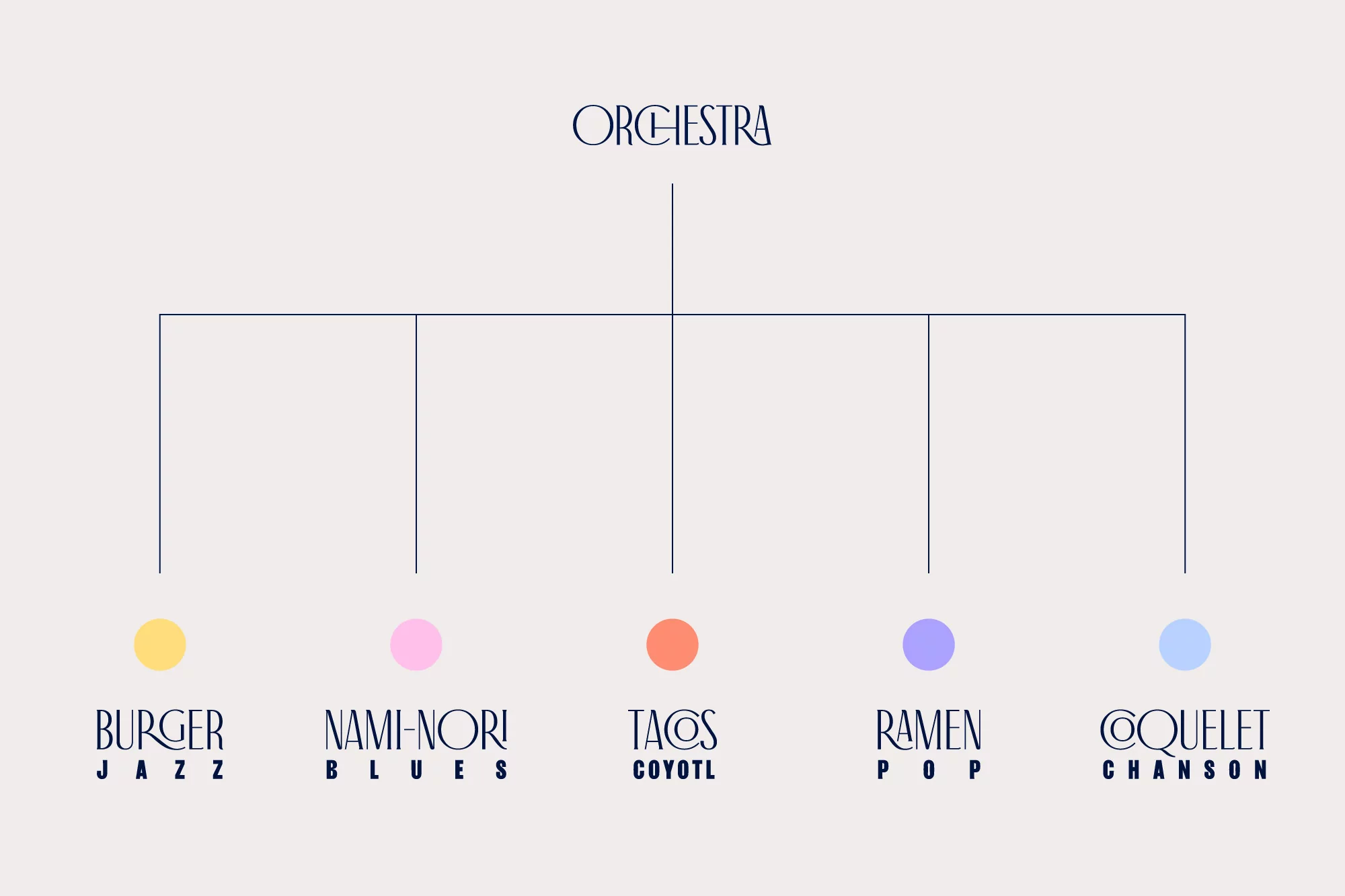
Graphic design presentation for the Orchestra Kitchen brand identity project, created by Grávita. The image displays an organizational chart diagram set against a pale background. At the top, the primary brand name appears in elegant, custom serif typography. Thin vertical and horizontal blue lines branch downward to connect with five subsidiary brand concepts below, each marked by a distinct colored circular dot in yellow, pink, coral, purple, and light blue. Below each dot, the subsidiary names and sub-genres are printed in matching uppercase serif lettering.