
BrandAustralia
ProjectBrand Identity
Australia Brand Identity 2021
Associated creatives


Tags
Description
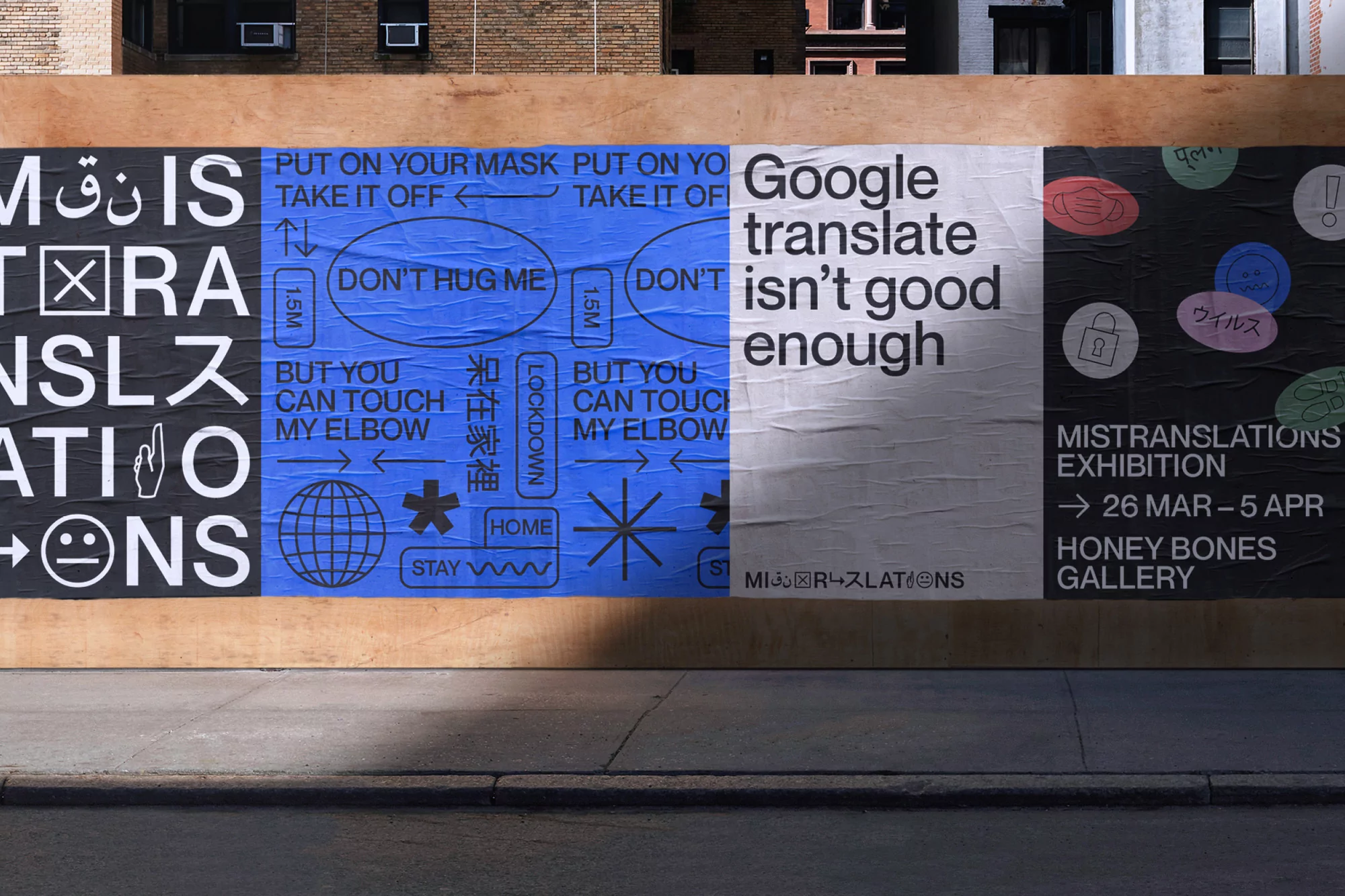
This image displays a series of paste-up typographic posters mounted on a temporary wooden construction wall outdoors. The design features bold multi-panel sections in black, blue, and white, showcasing various international scripts, pictograms, and English typography reading Google translate isnt good enough. The installation is captured in daylight with strong shadow lines cast across the lower wooden hoarding and pavement below. The overall composition highlights experimental graphic design and multilingual typography.
Style
Horizontal, Commercial, Graphic
Techniques
Typography, Spray paint / graffiti
Color
Jet Black (40%)
Royal Blue (30%)
Pure White (30%)
Background
Construction Site
Context
Advertising Campaign