
BrandHART
ProjectBrand Identity
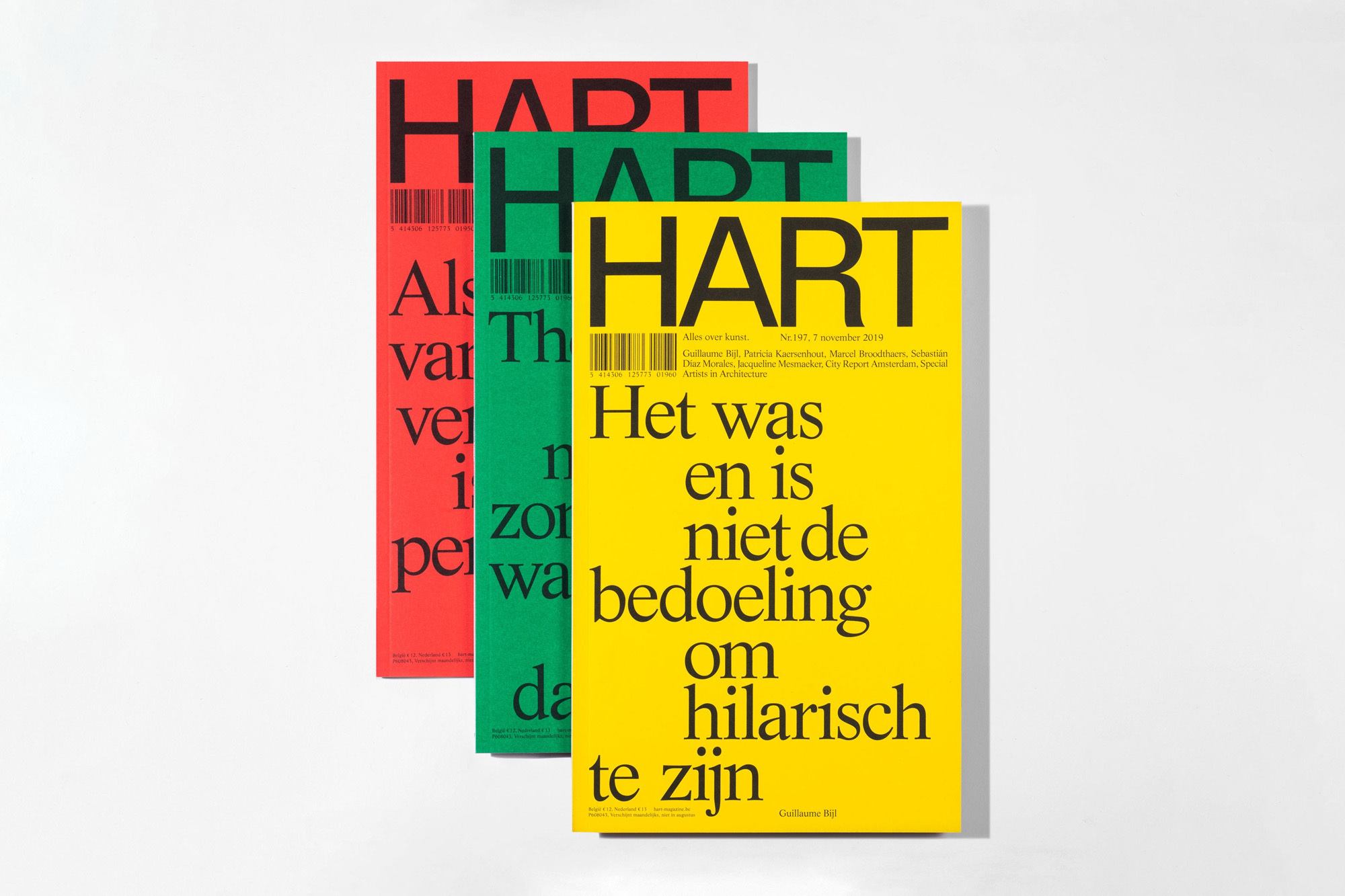
HART Brand Identity 2019
Associated creatives

Tags
Description
Three editions of HART magazine are arranged in a staggered stack against a neutral white background. Each magazine cover features a solid, vibrant background color: one red, one green, and one yellow. Dominant, bold black serif typography spans across the covers, presenting editorial text in a clean, high-contrast layout. A barcode and technical publication details are subtly placed beneath the magazine logo on each cover. The composition highlights a minimalist graphic design approach that relies on color blocking and strong, oversized text as the primary visual focus.
Style
Commercial, Square
Techniques
Typography, Infographics
Industries
Magazines