
Brand
ProjectBrand Identity
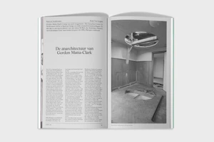
HART Brand Identity 2019
Associated creatives

Tags
Description
An open magazine spread showcases a minimalist typographic layout designed for the HART brand identity project. The left page features multi-column editorial text with prominent headings, while the right page displays a black-and-white architectural photograph depicting a room with a ceiling cutout and wooden wall paneling. Created with graphic design by Vrints-Kolsteren, the spread employs clean grid structures and sophisticated typography. The monochromatic palette emphasizes the contrast between text blocks and photographic imagery.