
ProjectBrand Identity
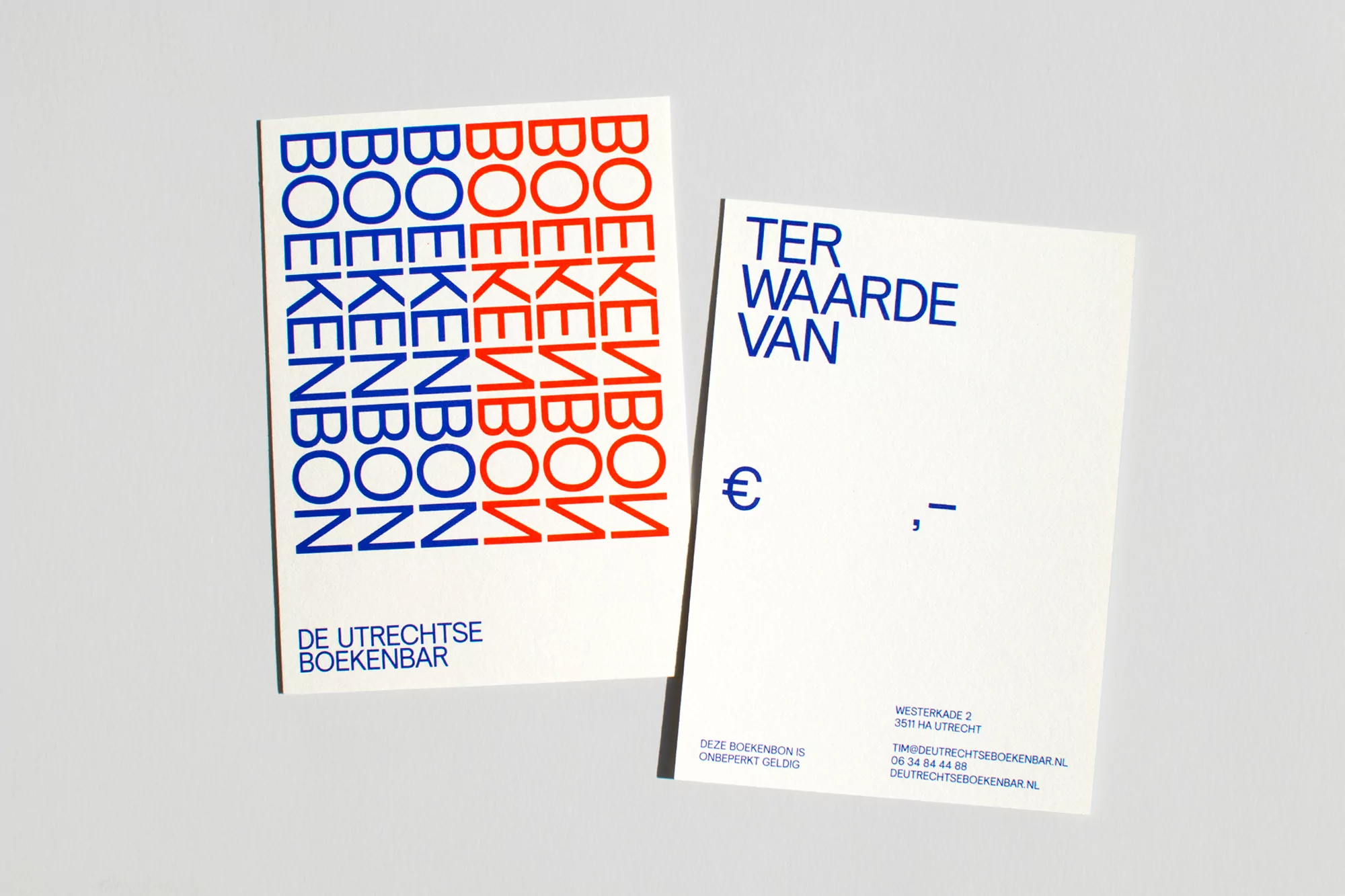
Brand Identity 2019
Associated creatives

Tags
Description
This image presents two printed paper cards resting on a neutral grey background as part of a brand identity project for De Utrechtse Boekenbar. The card on the left displays vertical columns of repeating text rendered in bold blue and red typography, with the brand name positioned at the bottom. The card on the right features blue sans-serif typography reading ter waarde van alongside currency and address details. Clean lighting and sharp composition highlight the graphic design work by Daan Rietbergen.
Style
Horizontal, Commercial, Clean, Minimalist
Techniques
Typography
Color
Royal Blue (50%)
Scarlet (50%)
Background
Grey Seamless
Context
Advertising Campaign