
ProjectBrand Identity
Brand Identity 2019
Associated creatives

Tags
Description
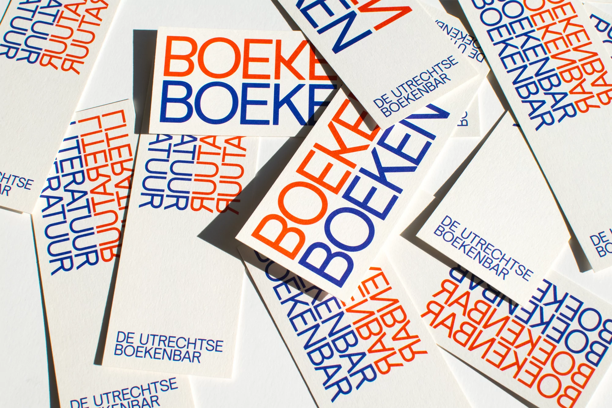
This graphic design project for De Utrechtse Boekenbar, created by Daan Rietbergen, showcases a collection of white paper cards scattered across a flat surface. The cards feature clean, bold typography printed in contrasting blue and orange ink, repeating words such as BOEKEN and LITERATUUR. Sharp directional lighting casts distinct shadows between the overlapping pieces, accentuating the crisp texture of the paper and the graphic composition.
Style
Horizontal, Commercial, Clean, Minimalist
Techniques
Typography
Industries
Digital Media & Publishers
Color
Pure White (60%)
Cobalt (20%)
Burnt Orange (20%)
Background
Paper Texture
Context
Advertising Campaign