
ProjectBrand Identity
Brand Identity 2019
Associated creatives

Tags
Description
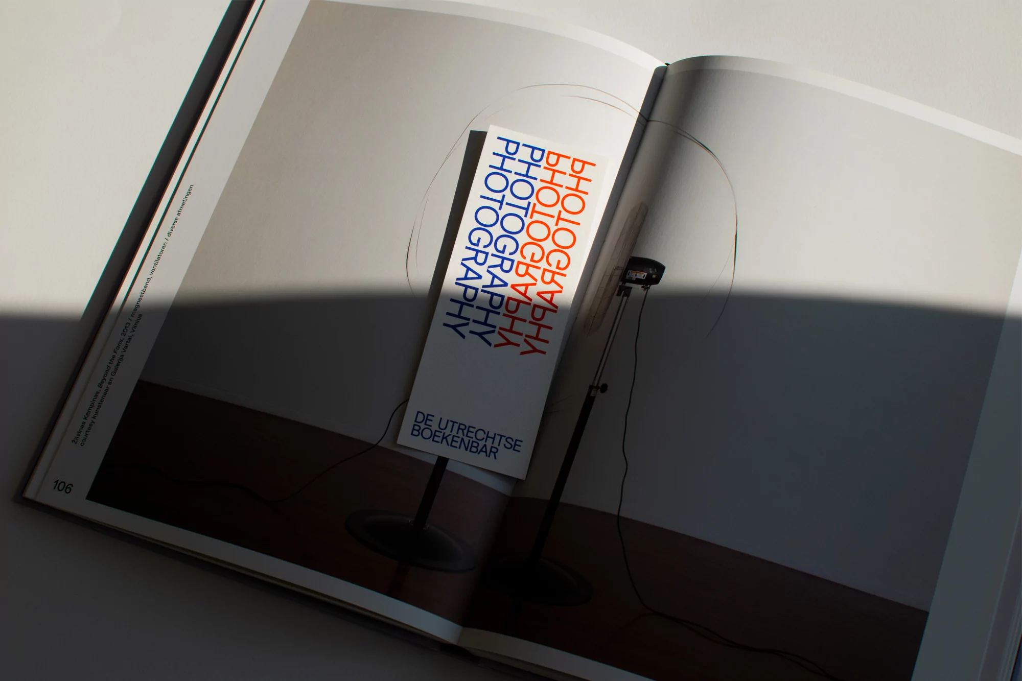
This graphic design project for De Utrechtse Boekenbar, created by Daan Rietbergen, showcases a custom-designed bookmark resting on the pages of an open book. The bookmark features bold, repeated typography in orange and blue tones spelling out photography alongside the brand name at the bottom. The composition is captured with natural lighting casting a soft shadow diagonally across the spread, highlighting the clean paper textures and minimal editorial layout. The piece forms part of a cohesive visual identity system designed for the bookstore.
Style
Editorial, Horizontal, Clean, Minimalist
Techniques
Typography, Natural light
Industries
Digital Media & Publishers
Color
Pure White (50%)
Cobalt (30%)
Burnt Orange (20%)
Background
Paper Texture
Context
Advertising Campaign, Website / Web