BrandT1 Energy
ProjectBrand Identity
T1 Energy Brand Identity 2026
Associated creatives


Tags
Description
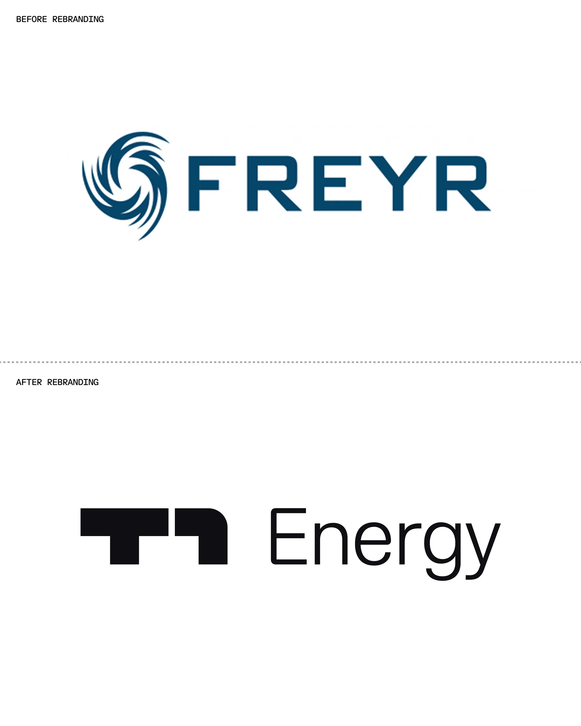
The image shows a before-and-after comparison of the rebranding of Freyr, an energy company. The 'before rebranding' section features a blue logo with a circular graphic resembling a stylized wave or turbine, alongside the company name 'FREYR' in a bold, sans-serif font, also in blue. Below a dividing line is the 'after rebranding' section, which presents a minimalist, black geometric symbol paired with the word 'Energy' in a simple, sans-serif font. The overall design has shifted from a more illustrative and colorful logo to a modern, monochrome design.