BrandWG+P Architects
ProjectBrand Identity
WG+P Architects Brand Identity 2020
Associated creatives

Tags
Description
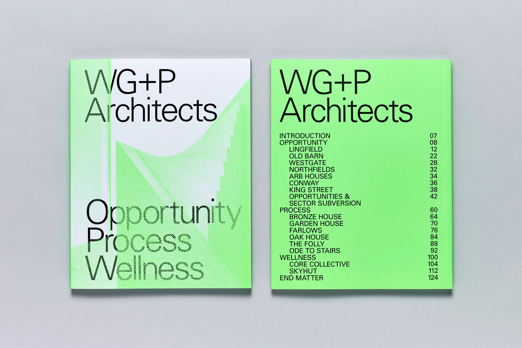
Two copies of an architectural book titled WG+P Architects sit side-by-side on a neutral surface. The copy on the left displays the front cover, featuring the firm's name in bold, sans-serif font above the words 'Opportunity, Process, Wellness.' A minimalist graphic of intersecting lines appears to the side. The copy on the right showcases the inside cover, which has the same title and firm name at the top, followed by a table of contents listing various architectural projects and page numbers. The overall aesthetic is clean and modern, with a focus on typography and simple graphic elements.