BrandSommerro Hotel
ProjectBrand Identity
Sommerro Hotel Brand Identity 2019
Associated creatives

Tags
Description
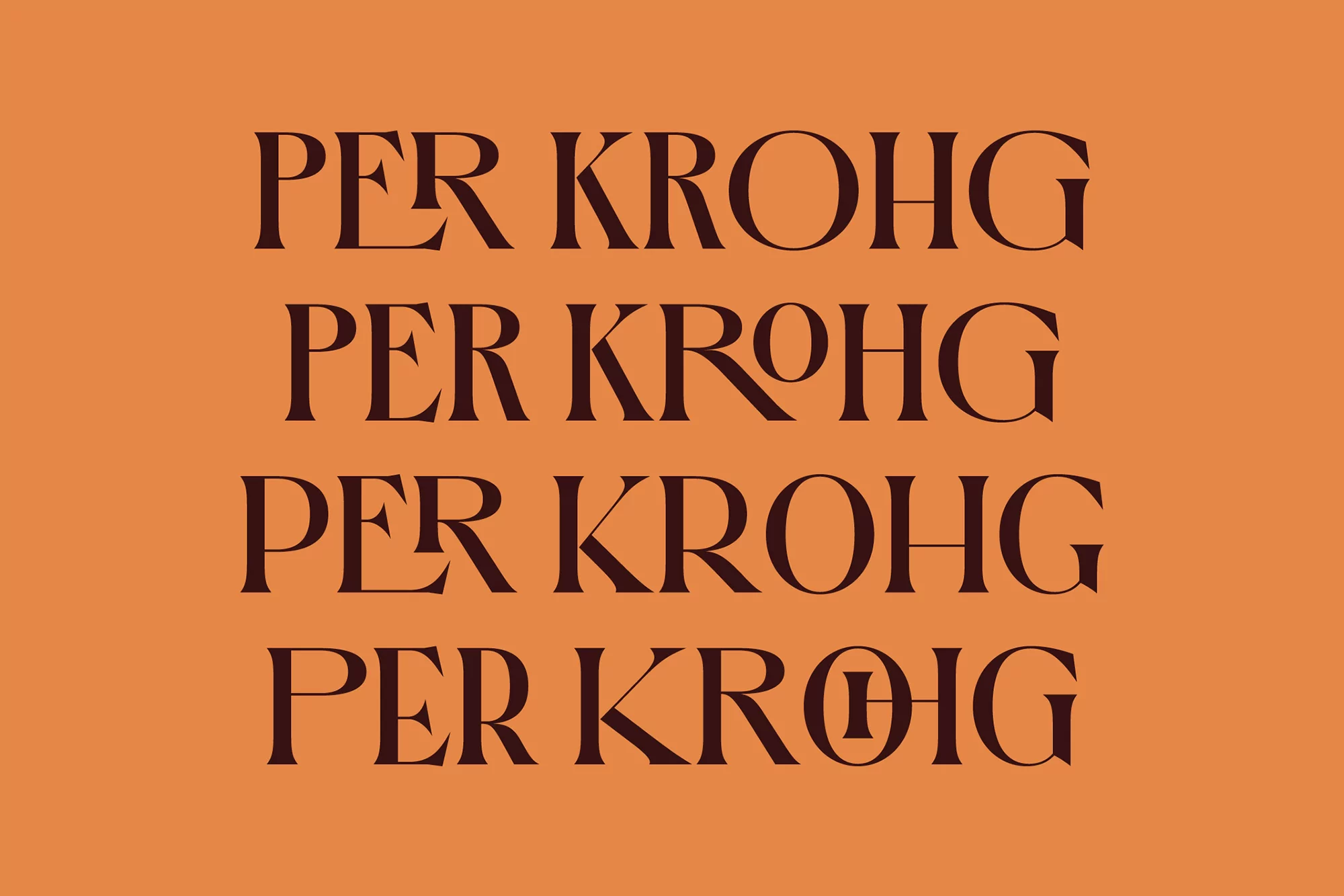
This image features a typographic design with the name "PER KROHG" repeated four times in a vertical stack. The text is rendered in a dark brown serif font against a tan background, providing a strong contrast and good readability. Each line of text is identical except for minor variations in the characters themselves. The overall aesthetic is clean and minimalist, focusing on the interplay between typography and color to create a visually engaging composition.