
Brand
ProjectBrand Identity
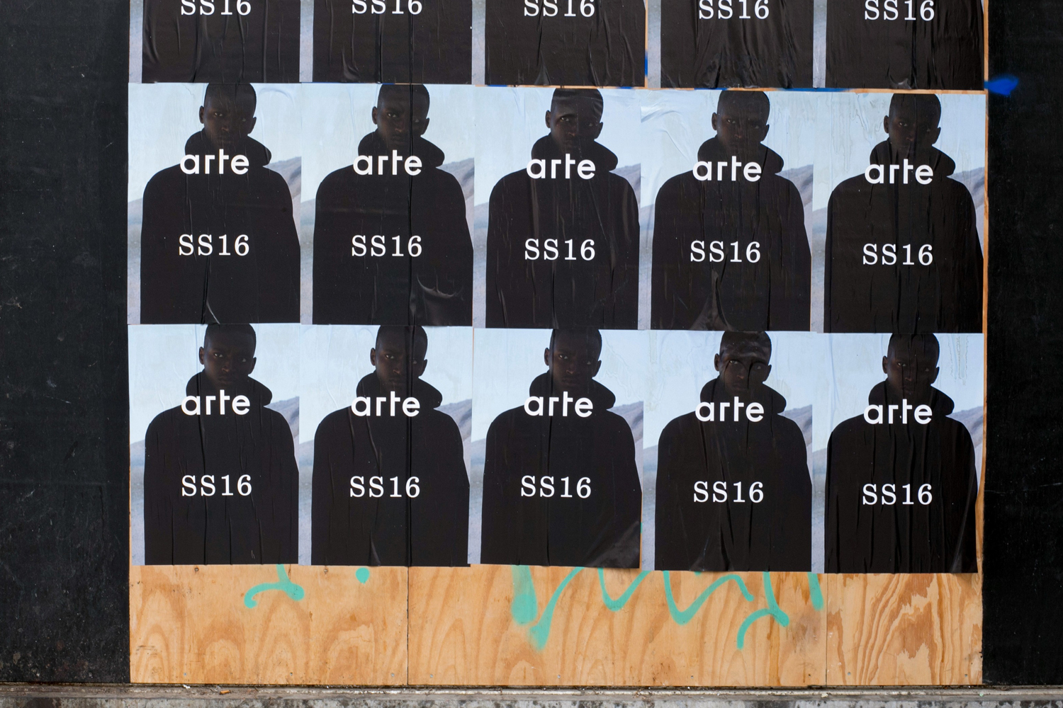
Arte Brand Identity 2017
Associated creatives

Tags
Description
A grid of repeated posters for Arte SS16 is wheat-pasted across a weathered wooden surface, creating a bold street-level visual repetition. Each poster features the word arte in clean white lowercase typography above the text SS16, superimposed over a silhouetted figure against a muted background. The arrangement forms a structured composition pasted across a dark backing with a raw plywood base below. Designed by graphic design studio Vrints-Kolsteren as part of the Arte brand identity project.
Style
Editorial, Horizontal, Clean, Minimalist
Techniques
Typography, Spray paint / graffiti
Industries
Streetwear
Color
Jet Black (70%)
Pure White (30%)
Background
Wood Texture
Context
Advertising Campaign